
The user interface of the aeroplane, and the experience of aviation
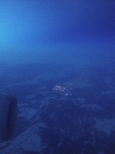
Flying from Singapore to Helsinki. We’re flying over an apparently endless landscape of dark forests and snow-covered hills, presumably Russia, rendered indigo in the velvety pre-dawn light. Settlements are picked out by clusters of yellowy-orange lights, connected by a vast web of white lines, roads and rail cutting through the trees and rock.
Most landscapes are transcendental from an airliner; Australia’s are particularly transcendental, if that makes any kind of sense. Flying up from Adelaide, towards Singapore, we pass over what I think is Lake Eyre, a body of water that is only sometimes water, a 10000 square kilometre salt pan. It’s as if Australia’s terrain is designed to be seen from the air. From the ground, as Robert Hughes and others have pointed out, Australia’s landscape has a beauty of its own, but it is not one that can be easily drawn from the lens of western aesthetics. From the air, however, the vastness of its systems can be quickly appreciated. It’s beyond Burtynsky.
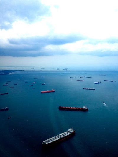
Similarly, flying into Singapore, we can sense the scale of the world’s economic systems, as with most of the eastern cities at this point. The water is full of tankers, container ships and smaller freighters, queuing to get into the port, patterns stretching towards the horizon. As the dark waters give way to land, suddenly everything is the pristine green of manicured golf courses, peppered with clubhouses. As I said at the time:
Of course this transcendental, strategic scale hits the all-too-down-to-earth reality of airports at some point; well, at numerous points. I started writing this in the altered realities of Singapore Changi airport, but when I got to Adelaide, on Integrated Design Commission business, I saw an artwork by the Russian collective AES+F which further “unpacked” the experience of airport — as purgatory — in “Allegoria Sacra” (2010–11)


At the Art Gallery of South Australia, in a wonderfully-curated ‘International Art Series’ show alongside pieces by the Chapman Brothers, Goya and a 16th century Japanese screen depicting a civil war, “Allegoria Sacra” is difficult to describe in terms of content — we were fortunate enough to be given a superb, florid and articulate introduction to the piece by gallery director, Nick Mitzevich, which took around ten minutes — but technically it consists of a 39-minute three-channel projection, composed essentially of animated digital stills at the scale of a gigantic tableau (this was apparently projected from the street, onto the gallery itself, for the opening; a smart attempt to turn this archetypal Victorian interiorised ‘house of art’ inside out.) Everything is in this piece; do take the chance to see it, if you can, in Adelaide or anywhere else.
I’ve written about airports many times before, finding them endlessly fascinating, but a year or so ago, I wrote a piece for Domus that focused more on the experience of flying an aircraft — which I’ve never done, I should hasten to add (not that this stopped me from writing it).
https://link.medium.com/UTj697e3jV
But the editor (Joseph Grima) asked me to write something about the developments in interfaces for flying, aka avionics. It sat alongside an article by an aviation expert which focused more on the developments in aircraft design, but I was to take an interaction designer’s point-of-view on the design of the avionics systems interfaces.
Here I also wanted to capture the sense of an interface’s possibilities: not merely in the functional, but also in conveying the sensation of flying — which is present as a passenger, never mind a pilot. This, despite the relatively mundane outcomes of avionics design, which are quite rightly risk-managed to the hilt. Hence the allusion to Ballard’s extraordinary book, The Unlimited Dream Company, amongst other things. That particular allusion should also suggest that this is a fairly exploratory, speculative piece.
There are a lot of question marks in this piece, perhaps tellingly, and as ever, this is the longer original edit, not seen in the magazine version — the ’30 Rock auto-pilot’ edit.
Interfaces for the unlimited dream of flying
“Fly with the confidence of knowing where the sky always begins.”
So says the marketing material for Garmin Cirrus Perspective multi-function display. It’s a rather poetic turn of phrase for what are essentially a couple of displays mounted in a cockpit. But this is the paradox of interfaces for flying, or ‘avionics’ — what happens when something as ethereal and other-worldly as the act of flying becomes experienced through hardware and software environments more commonly found in the grey cubicles of a Cisco branch office?
In fact, whilst they are rarely multi-touch interfaces (yet), contemporary avionics systems, such as L-3’s SmartDeck or the Cirrus Perspective (below) suggest a convergence not simply with personal computers, but with the latest multi-touch devices such as the iPad, iPhone, Android and so on.
This is in stark contrast to the impossibly complex array of controls and indicators that used to stud the cockpit of aircraft. To sit in a Dassault Falcon 10, a popular corporate jet throughout the 1970s and ’80s, is to sit amidst an orchestra of dials, switches, knobs, levers, sliders, joysticks, warning lights (below). The pilot is conductor, carefully and constantly calibrating the ‘plane’s performance.

Without data processing to generate abstract models of performance — ”Is the engine working correctly or isn’t it?” — aircraft could only report on the state of each individual component, and the pilot had to build the abstract model themselves (”This is the reading from the fuel pump, this is from the aileron, this is the air speed, this is the altitude and attitude — this, overall, means that everything is probably OK.”) The cognitive load on the pilot was considerable, given the number of components, and their relatively complex interactions. It’s also a physically demanding environment — a glance at the primary engine controls reveals a thicket of levers to be manipulated and coaxed into position.

The cockpit for Concorde — though now we’re really comparing apples with oranges — is more complex again, with virtually every centimetre of every surface an interface, as compared to the clean surfaces of the Cirrus Perspective’s automobile-like shell. The entire interior fabric is coated with dials, switches and knobs, as if a single performative skin.

A contemporary commercial aircraft, such as Falcon 2000DX EaSy, still looks extremely complex to the untrained eye, although clearly simplified. But as an interaction designer used to working with purely digital experiences, it’s a particular joy to see the sheer physicality — the full body experience — still evident in the ‘interface for flying’ that is the cockpit of a commercial aircraft.
Yet there has clearly been a significant shift in that interface. Looking at the L3 SmartDeck system, the cockpit, increasingly moulded and oriented around the pilot’s body, is dominated by tablet-like displays arranged in a something of a cross, as if an altar of information. The aesthetics of the interface, of the space, are increasingly refined; again in comparison to the Falcon 10, which was almost the plane’s raw engineering on display.

However, it’s still a highly functional environment, and still actually quite different to the dashboard of that of, say, a BMW 7 Series or the home screen of an iPad. There are two distinct schools of interface design at work here. We have the human-computer interaction (HCI) camp, which essentially predates the internet and forms part of the first wave of computer science as a discipline and practice. This was primarily an engineering-led discipline, injected with a strong dose of cognitive psychology, and can be seen at work in these older Falcons. And then we have the interaction designers, comprising those who matured as designers in line with the development of the web and other internet technologies, and whose closest understanding of that other world is perhaps through rudimentary flight simulators on the Spectrums, Commodores and Ataris of the mid-1980s. This later school does not seem to figure much in the world of avionics, yet. Note the launch video for the SmartDeck, which talks of engineers, pilots and human-factors, but not ‘design’ as such.
But looking at these new avionics systems, we recognise them. In a continuum between aircraft cockpit of 1950 and an iMac, they are of course only moving in one direction. The screens are full of data, but capable of switching mode or focus almost effortlessly. And screens increasingly control everything. There are on-screen ‘buttons’ with faux-bevels, GPS-driven maps provide navigation, and the systems themselves are essentially platforms, installed across multiple ranges of aircraft. The avionics systems — hence the suffix EaSy in the Falcon 2000 — do the processing for you, and flying can essentially become a question of lining up a series of indicators on-screen.
The benefit of all this abstraction is safety and precision. In theory, it enables the flying experience to be safer than ever, enabling the pilot to concentrate on other things. Yet is this the step forward claimed?
Decision-making on auto-pilot
There is a chance that the screens become so effective — they become by far the best way to perceive the location of a runway on a foggy night — that they override the complexity, the reality, through the cabin windows. And if commercial aircraft are increasingly flown automatically, perhaps much of this interface could fade away altogether. The residual interface seems there to cajole, to reassure, almost as a form of in-flight therapist rather than a controller that requires manhandling to generate necessary the shifts in air pressure.
(In US comedy ’30 Rock’, Matt Damon’s airline pilot character, in an argument with troublesome passenger (and troublesome girlfriend) Tiny Fey, angrily shouts at her: “Maybe you just wanna fly the plane yourself. Well good luck. You trying pressing (counts on fingers) Take-off, then Auto-pilot, then Land!”)
As avionics interfaces approach the condition of consumer electronics interfaces, they become less physical. The levers, buttons and switches evaporate into LCD or LED displays. These technologies are perhaps designed to enable you to enjoy the experience of flying, yet the dislocation from the physicality of flying means a disassociation with the reality of flying. As with soldiers operating unmanned aerial vehicles (UAV) in battlezones thousands of kilometres away, could this lead to a form of desensitisation? It might at least lead to a form of disengagement from flying itself; just as some motorists argue that cars with automatic transmission are not worth driving. “It’s steering, not driving”, they say dismissively.
While augmenting or extending human capacity in this way seems the right thing to do, at what point do these systems actually inhibit agency, learning and engagement? Perhaps they actually reduce the experience of flying, in attempting to make it easier, safer.
Do such interfaces even need to be there at all? Indeed, as Matt Damon’s exasperated outburst implicitly suggests, given auto-pilots do pilots even need to be there? Are we reducing the need for both pilots and interfaces in unison? The latter is only requred for the former.
Given that the passengers never really see them flying, it’s almost as if pilots could be played by actors most of the time. Ironically, Qantas’s in pre-flight safety announcements were delivered by “Qantas ambassador” John Travolta for the last few years, dressed in full captain’s regalia (admittedly, leaving aside the Aussie soft power own-goal, Travolta is an experienced pilot.) . As with doctors, might passengers one day hear the message “If there’s a pilot on-board, could you make yourself known to one of the flight attendants?”…
With commercial airliners, perhaps safety would be increased without humans — to a point just this side of HAL, that is. Given that the repetitive nature of airliner flying is such that no amount of engaging experience would make it appealing, it might as well be automated. If so, are we in effect making interfaces for things which don’t need to be interfaces?
There are parallels further back in the cabin of airliners. Here, the in-seat entertainment system now also controls much of the passenger’s immediate environment. You can end up navigating to a menu on a screen 100cm in front of you in order to switch on a light 20cm behind you. This is reminiscent of the control systems installed in hotel rooms around the world, which virtually involve “user training” before you can turn on the TV or dim a light. There is no need to reinvent the light switch, and airlines deploying in-seat lights with more usable and tactile physical switches will become valued for only making digital what ought to be digital. Designers are designing on auto-pilot, funnily enough, making interfaces because they can.
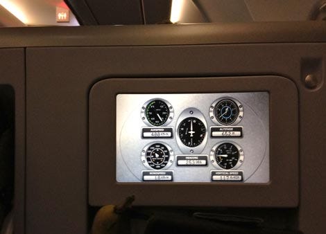
(The in-seat system on Finnair flights displays aircraft performance data during take-off, but via an interface which conjures the 1950s, all analogue dials set in chrome bevels and rivets. What is going on here?)
While simplification in avionics is there in order to reduce information to the absolutely necessary input, to reduce stress, and to enable better decision making, it could be that the first two aspects are done so well that the last, decision making, is actually obviated. This is not necessarily a good thing.
As a result of contemporary building control and informatics systems that automate seemingly mundane processes — automatically closing windows, turning off task lights, shutting down sleeping PCs — I would argue that people become passive rather than active “citizens”. It reinforces their lack of engagement in systems and spaces. In reducing allegedly unnecessary tasks, it inadvertently reduces active decision-making, The ‘smarter’ alternative in buildings may be systems that require more active intervention from people, which — depending on the climate and context — may require less automation rather than more. As Glenn Murcutt once said:
If you’re cold, put on a jumper. If you’re hot, open a window.
Might there be a parallel in avionics which reduces engagement, and decision-making, from pilots to the point where it is dangerous? Does it speak to a wider problem about a society on auto´pilot?
https://link.medium.com/UTj697e3jV
Rapid iteration at 30,000 feet
Innovation in interface design for commercial aircraft is a complex proposition. On one hand, the level of risk involved in flying necessitates a steady hand on the tiller, minimising risk through standardisation and gradual incremental improvement. Although these software-based cockpits could update their firmware as regularly as an iPhone can, in theory, the need for rock-solid system behaviour mitigates against this happening. If the Blackberry Playbook has low latency, it won’t sell; if a plane’s new interface has low latency, you might die.
Compared to the proliferation of interface innovation in the last 20 years, post-web, post-apps, the cockpit of the aircraft has moved at glacial pace. And yet given that aircraft are not really a mainstream consumer proposition, their interface idioms could develop more quickly than, say, that of the automobile. There, the basic interface for driving — steering wheel, pedals, gearshift, indicator stalks — has remained essentially unchanged for a century or so (as the MIT CityCar project showed most clearly when it attempted to reinvent that interface from the ground up.)
So in comparison to most cars, aircraft interfaces do seem to moving more rapidly towards device-land. It’s not as if you expect to see trending topics, Words with Friends, and Facebook feeds to be appearing on the L-3 SmartDeck, 30,000 feet over the Pacific — but it could.
Their magnificent flying machines
While that might be a recipe for disaster, how should avionics interfaces take advantage of contemporary interaction design thinking?
One of the perennial debates in interface design is around so-called “natural user interfaces”, in which the interface layer itself effectively disappears altogether. For instance, using physical gestures and multi-touch, a user might select, stretch, pinch, or rotate ‘objects’ directly, rather than via a separate, almost prosthetic device like a mouse. Those who use multi-touch devices are aware of the liberating feeling of touching the content directly, rather than through a proxy.
Yet older aircraft, with all that ‘engineering on display’, were also a kind of natural interface, with switches connected directly to actuators, as if the pilots were thrusting their hands into the body of the machine itself. Physically, their limbs became extensions of the levers, cables, struts and pistons of the aircraft’s mechanics, pilot and plane almost conjoined as one entity, rather than dislocated via avionics.
Would it be possible to retain the physicality and engagement of flying whilst benefiting from the increased levels of safety and precision that contemporary avionics introduces?
Apologies for bringing it up, but arguably the most influential interface in recent years is not necessarily that of Apple’s iOS or Google’s Android, but an interface that is not even real, in almost any sense. The science-fiction movie ‘Minority Report’ featured a large-scale multi-touch environment designed by John Underkoffler, where the physicality of movement and gesture involved almost put one in mind of a new Olympic sport.
A few years hence, the firm Underkoffler works for, Oblong Industries, have developed the g-speak platform:
Here, the interaction is physical, embodied, multi-sensory; again, manipulating information and action as if conducting an orchestra. In that, there are echoes of how pilots describe the act of flying in the old ‘stick and rudder’ days.
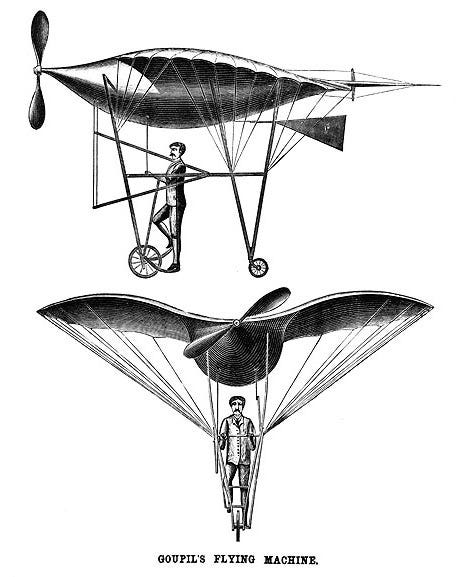
Instead of continuing on its trajectory towards the PC, perhaps avionics could leapfrog the disengaged device model to this richer form of interaction, and in so doing, re-capture some of the physical, embodied aspect of flying, in effect enabling a richer communion between “man” and magnificent flying machine? Recall the unwieldy early prototypes of aircraft, in which pilots were sometimes ‘standing’ upright, harnessed in a deeply mechanical contraption; ludicrous, yes, but somehow wonderful too.
Rather than the slightly denuded interaction seen in contemporary avionics, this might be a full-body experience; relying on the subtle interactions of physical gesture, or multi-sensory feedback — across touch, hearing, proprioception as well as sight.
Here, the plane itself becomes an interface again, as a genuinely embodied interaction (after Paul Dourish’s phrase). No more prodding of on-screen buttons — buttons that are not even buttons. Instead, the pilot is immersed and integrated with the aeroplane itself, freed from the fear of flying through avionics, yet free to experience the physicality of flying through a more embodied form of interface.
Thus, the act of flying might become closer to the elegiac state described in JG Ballard’s The Unlimited Dream Company, closer to the eternal dream of flying itself:
I saw us rising into the air … benign tornadoes hanging from the canopy of the universe.
What kind of interface might enable that feeling?
A version of this article first appeared in Domus magazine, issue 946, April 2011. This edit originally published at cityofsound.com on April 14, 2012.


Leave a comment