
Drawing and understanding public wifi in public places
Ed. This piece was first published at cityofsound.com on November 8, 2008. For some background to the State Library of Queensland, read this set of observations. Thanks to Tory Jones of the State Library of Queensland for permission to share this work-in-progress.
Following on from our ‘post-occupancy evaluation’ of the State Library of Queensland’s wi-fi (see previous post) in my role at Arup, I thought I’d share a couple of outputs.
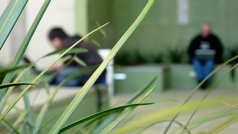
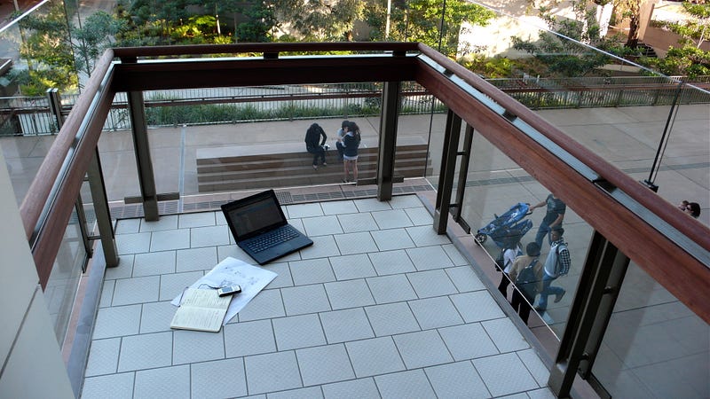
One of the ideas I’ve been exploring relates to how urban industry in the knowledge economy— ‘industry’, then, in the widest sense of the word — is often invisible, at least immediately and in situ. Whereas industry would once have produced thick plumes of smoke or deafening sheets of sound, today’s information-rich environments — like the State Library of Queensland, or a contemporary office — are places of still, quiet production, with few sensory side-effects. We see people everywhere, faces lit by their open laptops, yet no evidence of their production. They could be using Facebook or Photoshop, Excel or Processing.

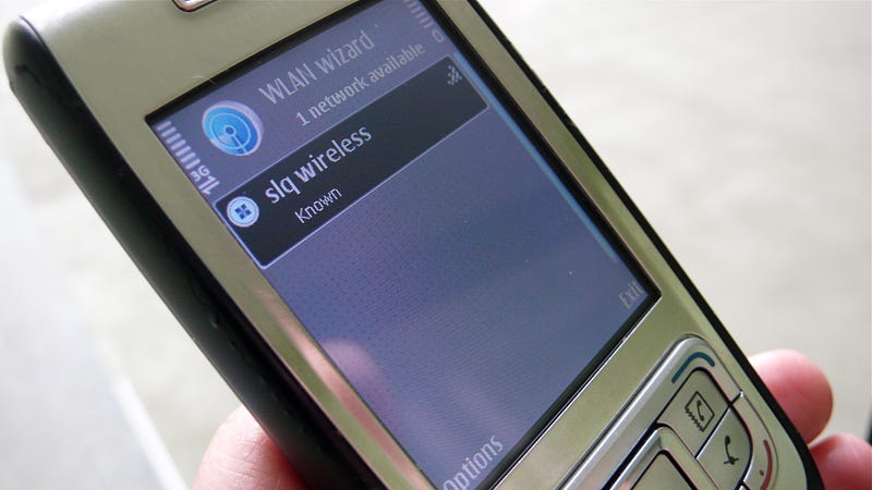
I’ve been developing a few ideas for exploring this industrial activity—some of which ended up in this idea of ‘new smokestacks’ for The Cloud project—but the post-occupancy work on the Library’s wi-fi involved creating a few representations of the service; a service which is all but invisible. Outside of monitoring the server logs, the wi-fi can only be perceived through the presence of users themselves, or of course via devices that detect wi-fi.

So as well as photo-essays, videos and in-depth interviews and surveys with users, and relating to this idea of making the invisible visible, I mapped the strength of the wi-fi signal across levels one and two of the Library, the primary areas that the Library’s wi-fi is used.
By taking readings across the floor of both levels, using standard wi-fi-enabled consumer equipment in order to mimic the conditions for the average user (in this case a MacBook laptop and a Nokia E65 mobile phone), I was able to construct a snapshot of the wi-fi signal strength across the Library.


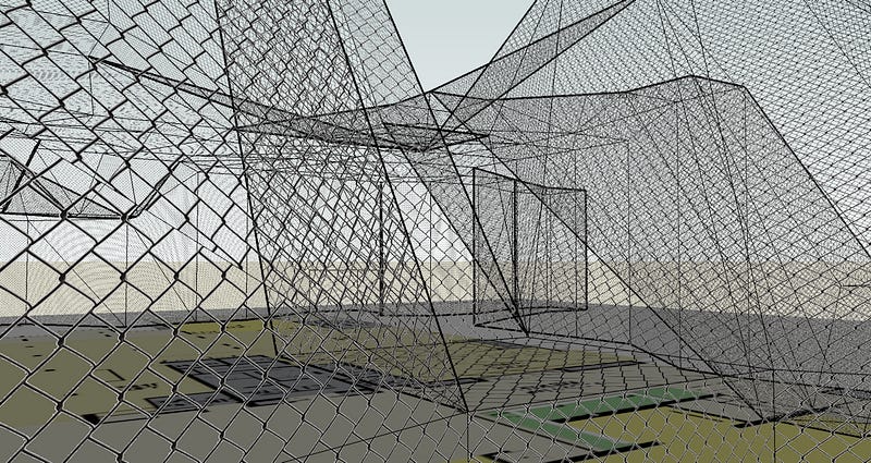
I then articulated this set of readings as a basic 3D model in SketchUp, with peaks representing good wi-fi signal strength (four bars, for example) and troughs representing poor wi-fi signal strength (no bars/no connection, or intermittently one bar). Each ‘bar’ defined a level in the 3D model (one bar = one metre, roughly). This gives a sense of the wi-fi as a shape, with a physical form. Although literally misleading, it helped to understand wi-fi as a discrete phenomenon, via a form of translation. This is what the wifi would look like, spatially, if you could perceive it as a physical form (it is a ‘physical form’, of course, but let’s not complicate things.)


While this model is not intended to be totally accurate — wi-fi signals may change in different atmospheric conditions, and perceived signal strength will vary depending on the equipment used, nor does it give a sense of ‘throughput’, which might be more relevant — it does convey a sense of the overall ‘shape’ of the wi-fi.
Sensing the wi-fi like this is almost akin to dowsing — detecting the presence of unseen forces — and mimics the sensation of users attempting to discern where the wi-fi signal is strong. In fact, we would often see users walking around with the open laptop held out in front of them as if a dowsing rod, meandering towards the strongest signal.

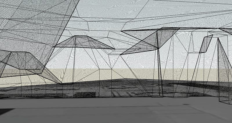
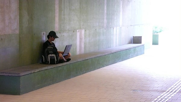
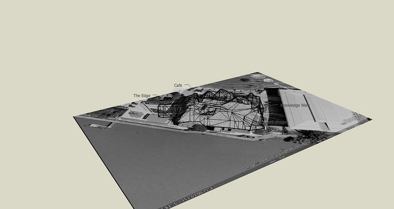
The model was initially overlaid onto a floor-plan of level one, and subsequently scaled up to sit over a snapshot of the site from Google Earth. When comparing with the built form, we can explain the strong signal over the north-western egress of the Knowledge Walk. Through our observations at the Library, we saw that users have figured out that this is a good spot — one of the three wireless access points currently on that floor is located in the nearby meeting rooms, not that users would know this.
The presence of the ‘bench’ extruded from the wall provides useful affordances for users too, almost suggesting it’s a good spot to sit and access the wi-fi (although again, we know that is coincidental placement). Similarly, the floor-to-ceiling windows from meeting rooms and open corridor leading outside means there is minimal concrete to block the signal. So this 3D model helps suggest a correlation between use of the space, the shape of the space, and the strong wi-fi signal.
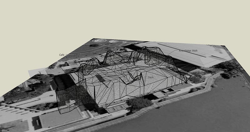
Following the central spine of the wi-fi model through towards the south-eastern edge, we can see how the wi-fi ‘leaks out’ of this end of the building, through the open end of the Knowledge Walk outside onto the concourse in-between the Library and the building destined to be The Edge. Elsewhere, thick concrete mitigates against wi-fi spreading far, unfortunately including the café and the fabulous deck areas on the river, where the signal falls off sharply (currently).
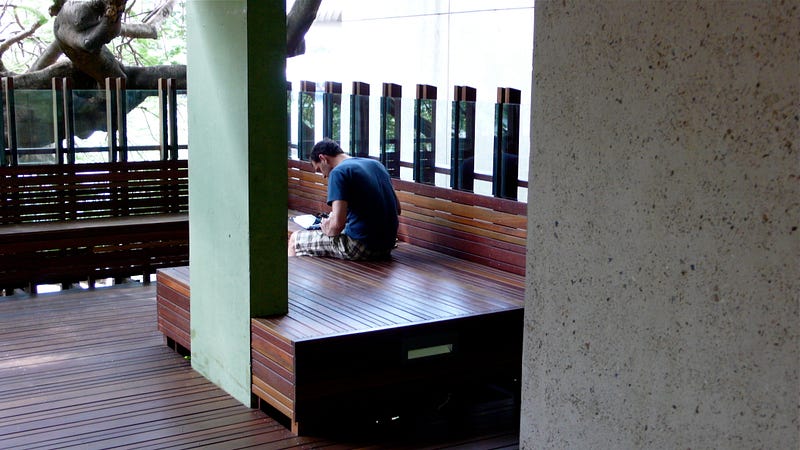

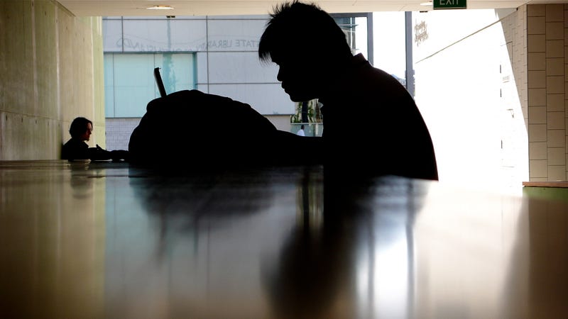
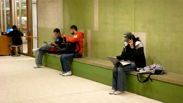
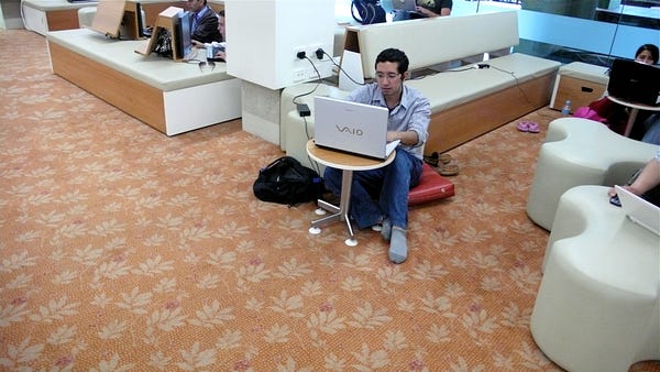
Equally, there were many other places that users were sitting that were clearly not necessarily designed—from an architectural point-of-view—as places for people to sit and work, suggesting an awkward mismatch between the usable spaces defined by digital connectivity and the usable spaces defined by the architects, or organisation.

I allocated the SketchUp model a skin of netting, in a nod towards the Cedric Price-designed aviary at London Zoo. This seemed to me a similar structure, and suggests that ‘wi-fi cloud’ might actually feel like a containing volume — a net of wi-fi, as if seen from a user’s or bird’s point-of-view.
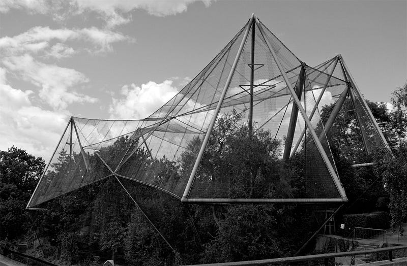
Formally, the result is hardly elegant, and bears little relation to the AIA award-winning structure by Donovan Hill/Peddle Thorp. The sharp angles and abrupt faces are accidents of the crude construction in SketchUp and the simplicity in my measurements. I should probably take it into 3D Studio Max or something, to render it with more graceful curves, or a material that would more properly represent the qualities of radio waves — perhaps something like Diller+Scofidio’s Blur Building.
Ed. I wish I’d spent a bit more care on the model, or got someone to take my SketchUp and produce a more careful rendering in AutoCAD or equivalent, not least to capture its more atmospheric, organic qualities. The form above is too angular, despite the happy, accidental echo of Cedric Price's aviary. The video ended up being used all over the place, including being exhibited in the Laboral exhibition, ‘Bending the Urban Frame’, in Gijón in 2010. Take care over what you make! You never know what’s going to resonate elsewhere. I'll remake it one day.
There’s a full set of screengrabs here, here’s a fly-through animation, and here’s the original SketchUp model. I don’t want to overplay the significance of this approach — it was simply one of several methods for expressing the presence of wi-fi in the Library, and partly just sketching out loud. But essentially, the client (the library) wanted ways of understanding what was going on here, in terms of the wifi and the library. This first basic step involved simply capturing the activity and representing it, and this was one technique amongst many we used, alongside surveys, interviews and observations, during a week-long ‘occupation’ of the library.
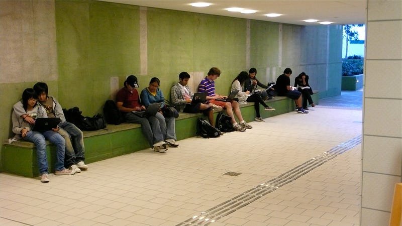
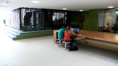
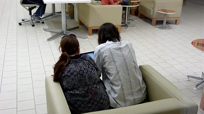
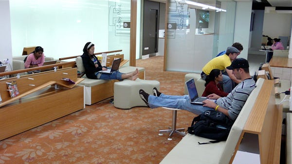
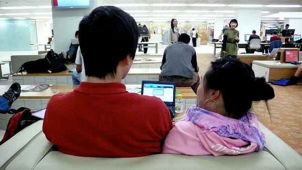
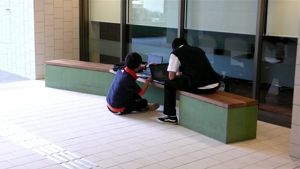
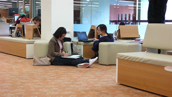
Constructing another tangent on the wi-fi, I was struck by how users adopted the Infozone space — where the wi-fi is primarily located, alongside rows of legacy PCs — and the furniture provided for them. The low desks, small tables, various chairs, benches etc. afford numerous variations for wi-fi users, and sure enough people drape themselves all over them. Much of our survey addressed why people came to the library to use the wifi, given most had broadband at home, and we think it is some combination of being the nicest place to use the Internet in Brisbane with the ability to meet friends, colleagues etc. I like the Peter Wilson quote, about a library being “a place to read a book in public”, and would extend this now, as it is also ‘a place to use the Internet in public’.
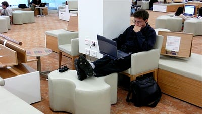
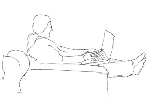
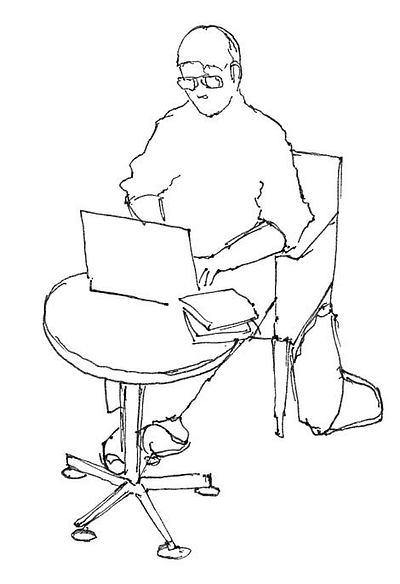
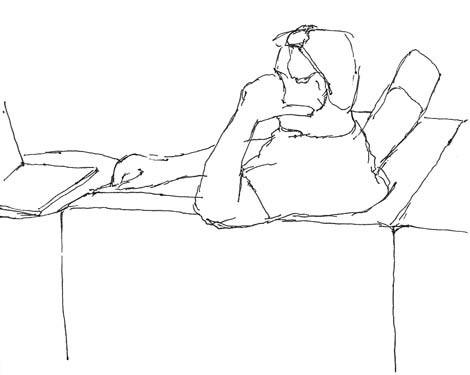
Discussions with Donovan Hill’s Timothy Hill indicated how the design of furniture across the Infozone was intended to, in his words, “break up the traditional anthropomorphic relationship between the user and their laptop”, based on observations of how intimately people actually relate themselves to their laptops. Timothy had noted how people rest the laptop on their knees, lie down with it, use it in bed, curl up around it on the sofa, and so on. So the fixtures and fittings in the Infozone were intended to suggest this intimacy — in common with the ‘domestic’ touches in the design of the Library in general — and provide a wide variety of options as to how to use a laptop in the space.
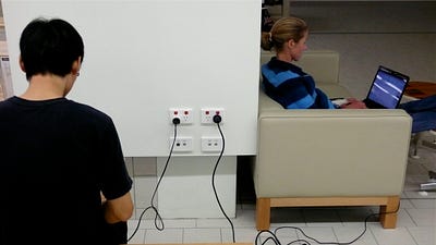
That brilliant observation played out very positively, but equally, the Library was not ready for how successful this strategy would be. Ultimately, people are adopting the space and adapting it to their needs, and sometimes the space responds elegantly. Sometimes, naturally enough, the end result is uncomfortable, awkward—but credit to the Library for engaging with this unfolding activity, and allowing us to design in and around it. I documented many of these various uses and adaptations, spending days and nights there, noting how people were drawn like moths to the flame of the power socket—or to the flame of each others’ company—as well as their own physical adaptation to the undulating ‘New almost-Domestic Landscape’ of fixtures and fittings and furniture—and now fibre. Ultimately these observations generated numerous insights to run alongside those from the surveys.
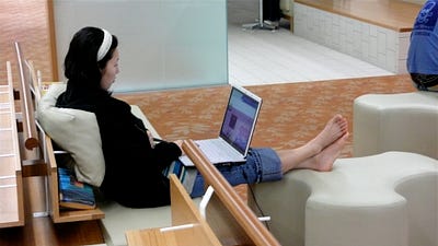


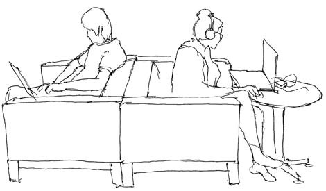
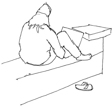
As well as the hundreds of photos I took in the space, I decided to do a few sketches of the more interesting positions, which I suggested might work something like a aircraft identification manual or a compendium of yoga positions perhaps. With the latter in mind, I was tempted to name a few, such as “The perch”, “The front crawl”, “The huddle”, “The sandwich”, “Battleships”, “Reverse Battleships”, “The Horse”, “Side saddle”, “Lotus”, “The NASA control room”, “The occasional-table hug” and so on.
Below, a few of the quick sketches I did, illustrating some of these positions. Again, this was no more than an attempt to make visible and tangible this activity, and these are kind of off-cuts of the much broader project.
Ed. That ‘broader project’ ultimately led to a revamp of the service, quadrupling the coverage of wifi in the library and strategically locking it in as a core service, as part of its knowledge strategies (as opposed to the unwelcome insurgent some staff initially perceived it to be!). It also led to broader strategic work across the SLQ, defining a futures strategy for the Library, as well as the strategic design of an entirely new function, The Edge. More on all that later.


Ed. This piece was first published at cityofsound.com on November 8, 2008. For some background to the State Library of Queensland, read this set of observations.
Ed. The background to this particular work is here:


Leave a comment