Charles Holden’s ‘building for 500 years’ becomes Orwell’s Ministry of Information but not Hitler’s London headquarters
This is №2 in an irregular series of reports from London’s Open House weekend: Senate House, University of London (№1 was the Daily Express Building, Fleet Street.) (Ed. This piece first published at cityofsound.com on 21 November 2003. Please excuse the image quality of my photos from Open House; they were taken on a ~2003-era digital camera.)
Senate House is of a similar vintage to the Express building yet feels more of a transition point; balancing classicism and modernity beautifully.
Indeed, before I continue, it’s worth nothing that if any of you want real facts and academic opinion on the building, I can recommend Classicism and Modernity: The University of London’s Senate House, by Richard Simpson, reprinted from the Bulletin of the Institute of Classical Studies 43–1999, (School of Advanced Study, University of London), which is largely the source of quotations here, unless noted otherwise. Otherwise, reportage is based principally on wandering around with a camera.
Facts first: constructed throughout the mid-1930s, Senate House was designed by the brilliant Charles Holden, architect of several undoubted classics of London architecture, particularly London Transport headquarters at 55 Broadway and its satellite network of tube stations at Arnos Grove, Boston Manor, Clapham South, Morden, Southgate, amongst others. More about him later. (Ed. And much more in the excellent biography ‘Charles Holden: Architect’, by Eitan Karol, which Eitan very kindly sent me a copy of, subsequent to me posting this.)


But before Holden was on the case, the necessity for an headquarters for the University of London had long been established. A University since 1838, a major reform in 1900 indicated the need for an administrative headquarters for this, what “ought to be the chief centre of learning in the entire Empire, perhaps the chief centre of learning for the entire world” (said Lord Haldane, quoted with approval by Lord Macmillan, one of the key clients and prime movers behind building Senate House.)
This reform meant the University of London had a unique federal structure compromising 19 colleges and 11 institutes. Now this may be a more common approach, but it posed a problem at the time, particularly when it came to coherently describing its physical presence. The other key client for the eventual building, Lord Beveridge, upon becoming director of the London School of Economics, asked a cab driver to take him to the University of London. The cabby “looked blank. As I explained, a light broke on him. “Oh, you mean the place near the Royal School of Needlework.” I discovered that this was what I did mean.”
So the new building had to be noticed. And rather more than the Royal School of Needlework with, er, all due respect.
In the manner of clients before and after, there were copious requirements before the architect was even onboard. The idea for an HQ in Bloomsbury was as old as WWI, and thoughts as to the building’s form and function had been festering since that time. Beveridge’s ‘suggestions’ indicated that the building was for:
“(A) University for the nation and the world, drawing from overseas as many students as Oxford and Cambridge and all the other English universities together. It is a civic university for the ten millions of greater London … the central symbol of the University on the Bloomsbury site can not fittingly look like an imitation of any other University, it must not be a replica from the middle ages. It should be something that could not have been built by any earlier generation than this, and can only be at home in London … (the building) means a chance to enrich London — to give London at its heart not just more streets and shops … but a great architectural feature … an academic island in swirling tides of traffic, a world of learning in a world of affairs.”
Beveridge himself introduced the notion of the tower, ‘suggesting’ that the eventual architect “will think, I hope of at least one tower, with a great bell, a muezzin, calling the children of the University in all lands.” He actually went on to light-heartedly suggest that the tower should feature “a great clock where eight mechanical deans of Faculties and five-five Senators dance each day at noon round a mechanical Chancellor.” Beveridge got his wish with the tower; sadly not with the mechanical clock.
Charles Holden won the commission on the back of his London Transport HQ, over a black-tie dinner face-off versus Sir Giles Scott (of red telephone box, Battersea power station, and Bankside/Tate Modern fame) amongst others.
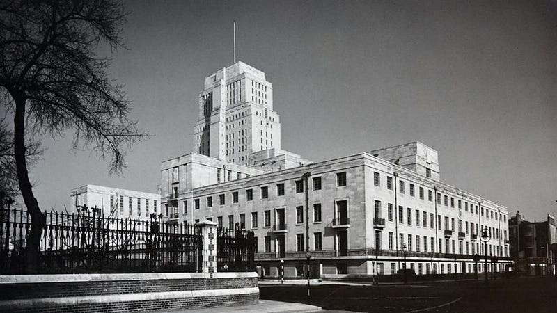
And Holden’s original plan, published in 1931, would certainly ensure that cabbies would notice it. A vast linear spine with 2 towers and 17 courtyards extending from the British Museum to Byng Place, it would have dominated Bloomsbury and much of central London, taking 20 to 30 years to complete. Of course, it never got built. Only the first part of the approved 1932 scheme, the Senate House incorporating the Library, was constructed with plans for the rest abandoned by 1937.
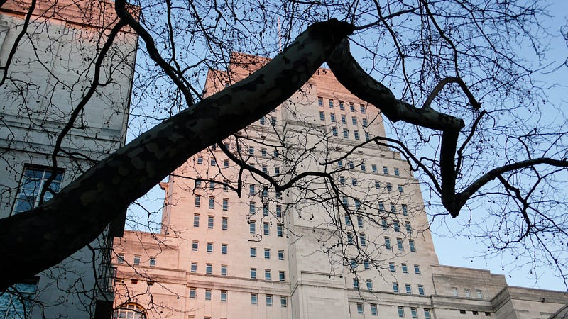
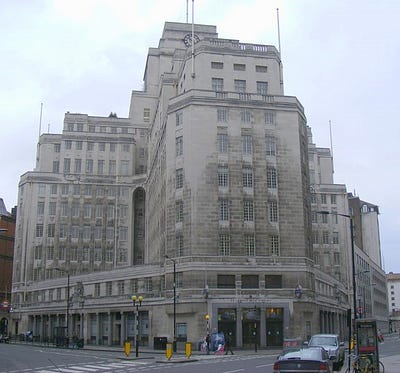
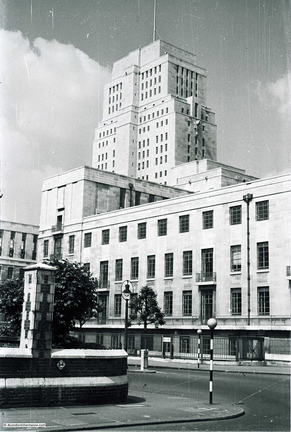
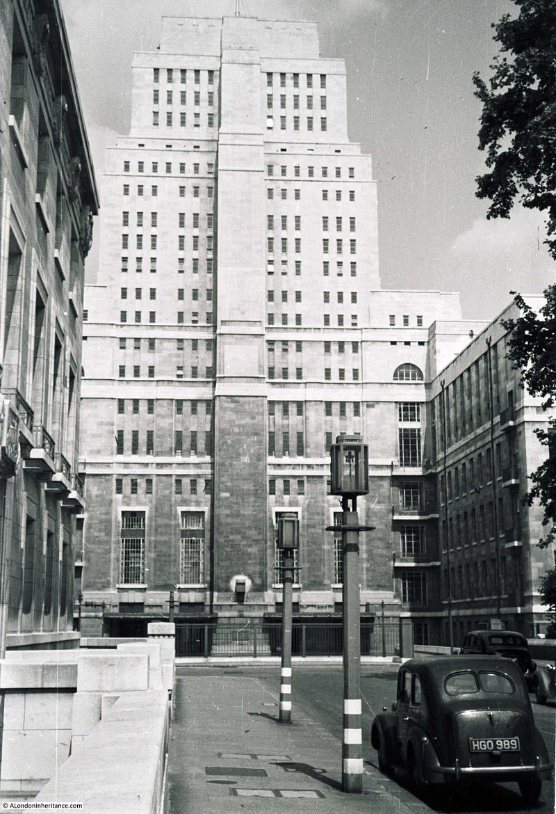
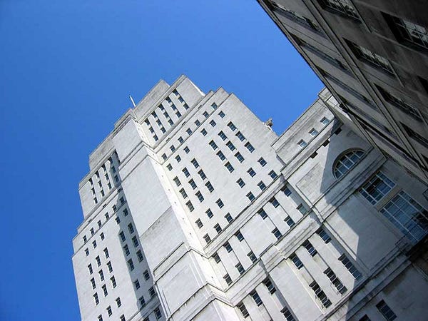
None the less, this was the most significant new building in the city. Holden designed the tower to taper deceptively, to “appear with quiet insistence”, yet it was the tallest building in London (save the sacred St. Pauls) for years, and referred to as “London’s first skyscraper”. It’s still a significant presence in central London’s skyline.
Yet perhaps thanks to Holden’s ability to make a muscular, impressive building appear graceful and discrete, Senate House was largely considered a success even in a city which still struggles with landmark architecture. As Lord Macmillan quipped, in a vote of thanks to Holden at RIBA in 1938, “this is almost the only building in London which has ever been erected without an acrimonious correspondence in The Times!”
As Simpson notes, Holden was “more responsive than many to the radical developments in contemporary architecture”, but he managed to balance his modernist sensibilities with a classical bent appropriate for this client. And he was ideally skilled to do this.
“Holden embodied both the architecture of the modern and that of the past. A master of the traditional classical form with a profound knowledge of construction and materials. His modernity came from his belief that architecture should, ‘…throw off its mantle of deceits; its cornices, pilasters, mouldings…’ He was far more concerned with functional problems; how rainwater could naturally clean a wall; the flow of pedestrians through a building.” (Originally from charlesholden.com, sadly now a broken link)
The magnificent tower is the main point of interest in the exterior of the building, much of the rest achieving a quietly powerful grace, devoid of ornamentation in the ‘stripped-classical’ aesthetic Holden had pioneered in his London Underground architecture.
The underlying structure defines the form, pyramidal for stability within a traditional load-bearing masonry construction (Holden rejecting the untested steel frame form for a building he intended to be “designed to last 500 years”, though across the pond architects were tossing up steel frame constructions with gay abandon in delirious New York.)
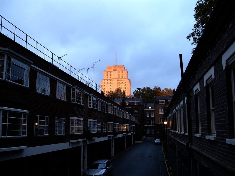
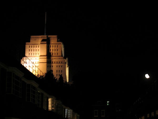
The tower dominates the neighbourhood I live in, looming over numerous approaches:
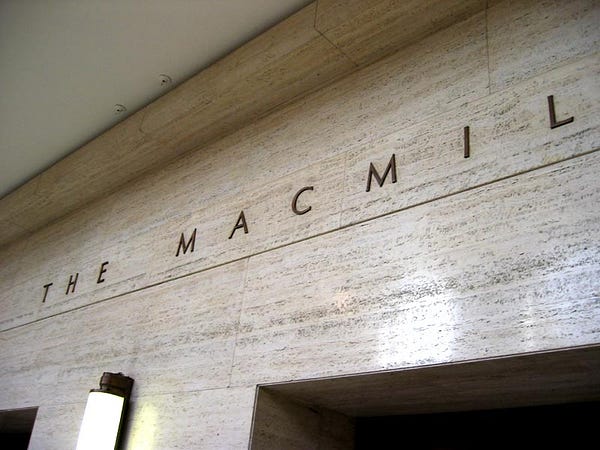
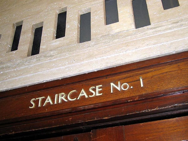
The ground floor is faced in Cornish granite and with upper floors in Portland stone. Other than that, my interest is in the interior. The pedestrianised entrance is magnificent, and the Ceremonial Hall itself was too impressive to be constrained by my camera. The Hall is flanked by the William Beveridge Hall and the Macmillan Hall, titles picked out in a delicate light san serif. Above the staircase signs, Holden’s clever cuts into the stone provide natural ventilation.
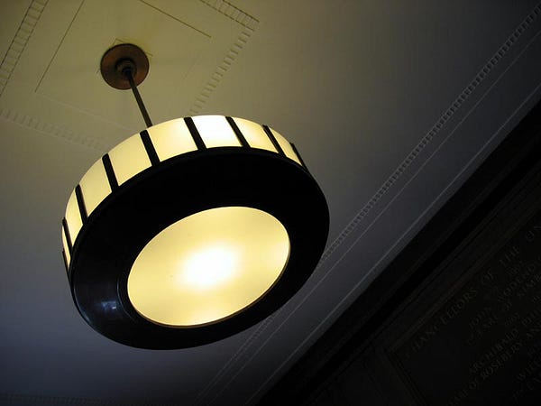
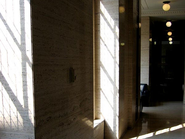
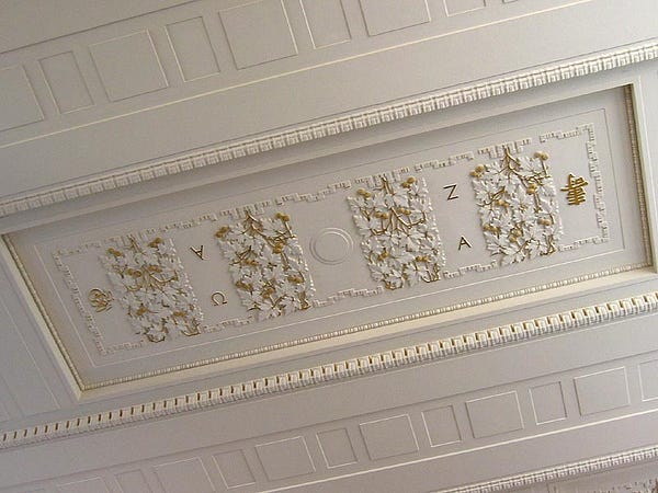
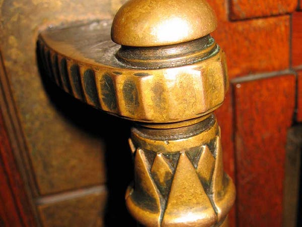
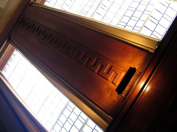
Inside, the quality of build is still wonderful, airy corridor upon corridor of marble, wood, and natural light streaming through thick leaded glass, lofty ceilings pitted with burnished hanging lamps. Holden’s appreciation of Greek architecture, again balanced with austere modernity, is visible throughout, and the detailing on balustrades, columns, and ceilings are a joy, from the brass handles to a ceiling patterned with depictions of various forms of alphabet across ancient cultures — a ‘university for the world’ indeed.
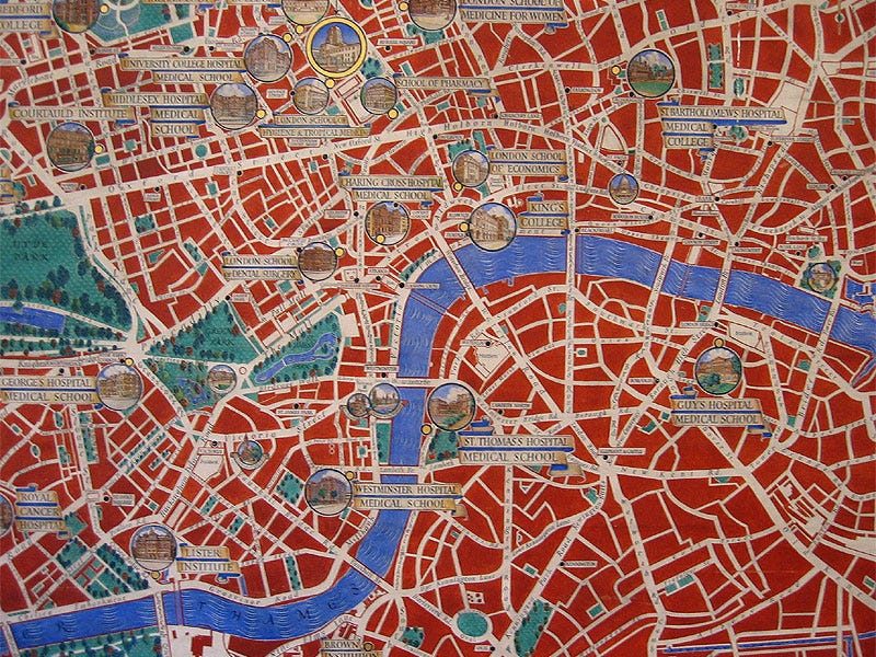
The Chancellor’s Hall features an astonishingly lovely and intriguing map of London, painted by Macdonald Gill in 1939, showing the location of University premises. It’s a map of London, organised by learning. It’s huge — approximately 4m across from memory, with some sections left blank, no doubt for future expansion. For those interested in alternative mappings of the city, it’s well worth a visit just for this. Here’s a detail:
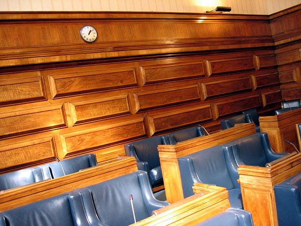
The Senate rooms are panelled in furnished in English oak or walnut, desks set with personal microphones and lighting, ceilings disappearing into infinity.
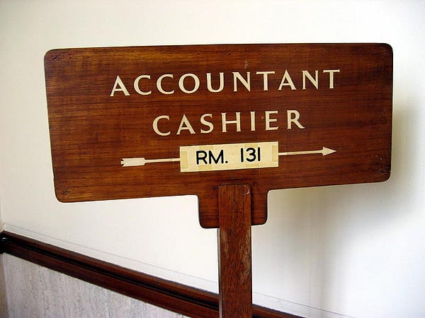
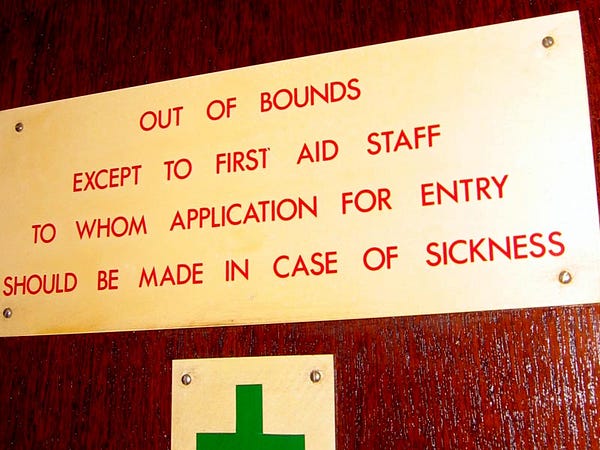
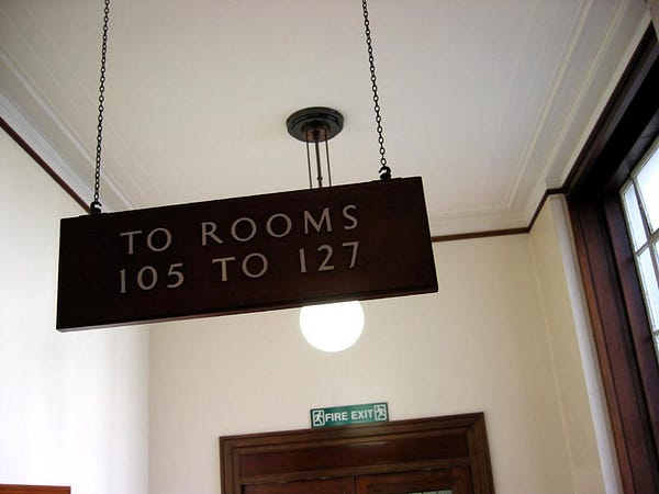
In terms of signage, the whole place is a quiet riot of classical thirties typography and restrained haughty authority: from appropriately austere Cashier’s office signs, to the kind of notice for a First Aid room which would make you reconsider in all but the most dire of circumstances; stairways tiled in translucent white, with floor numbers inset in Bentley greens; signs for room numbers dangling from the generous ceilings.
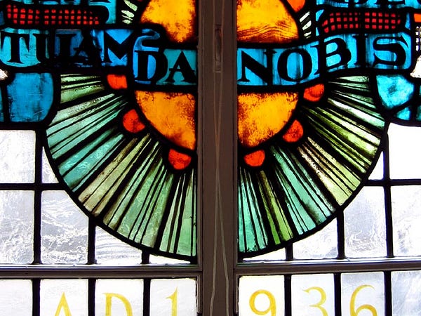
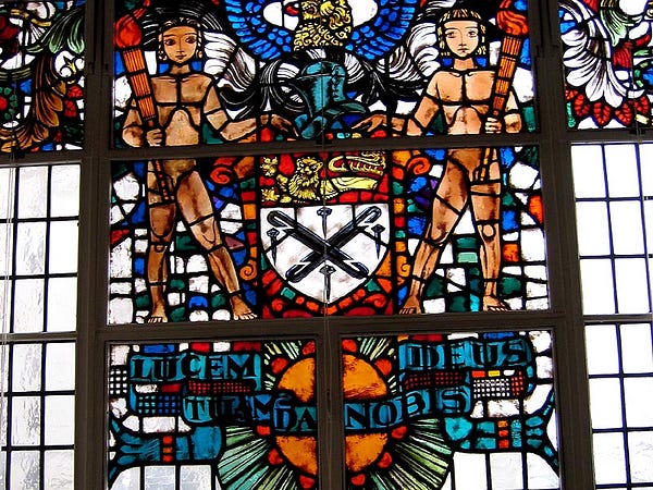
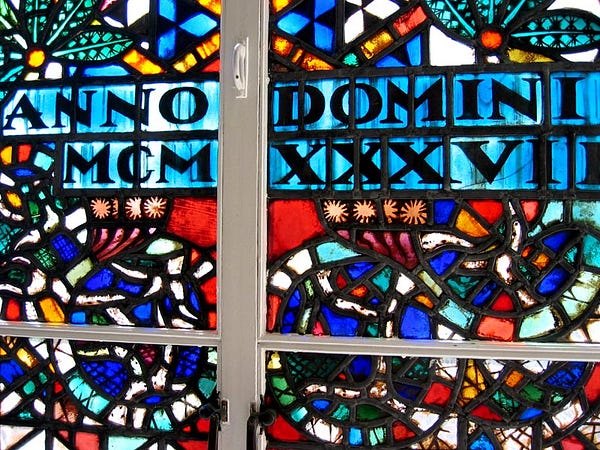
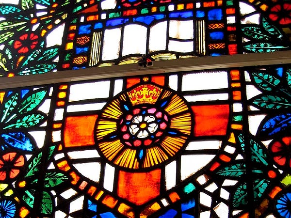
The stained glass windows here are quite stunning, achieving a sense of modernity within this traditional format. Not quite as progressive as other early 20thC stained glass, say those by Frank Lloyd Wright or Josef and Anni Albers, but again, almost exemplifying the balancing act the building as a whole achieves: classicism and modernity. It helped that they were brightly lit by a crisp early autumn light.
The heating, gas, and water services are cleverly concealed within window recesses. Holden was keen to integrate services fully with the design — “things commonly thought ugly, connected with the physical needs of life which the architect has to accept with gladness as by no means negligible ingredients in his masterpiece.”
It’s an intriguing and noble thought in a building of this vintage, but not being able to separate the service layer from the structural layer must cause problems in terms of an adaptive design.
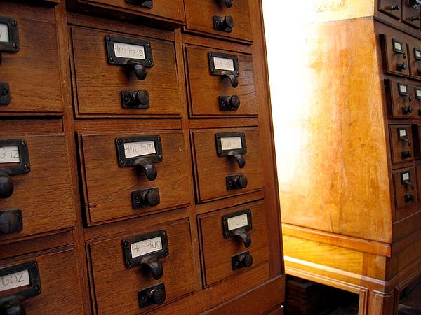
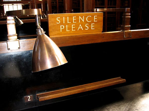
The Library is a fabulously peaceful place, entirely consistent with a traditional notion of early 20th century learning. Lovely study desks with brass lamps and forbidding SILENCE signs; serried ranks of gorgeous filing cabinets providing early information architecture.
When focusing on the interior in this way, which is the point of Open House after all, the building actually reveals the extent of the team effort involved: the furniture fitters, interior finishers, signage manufacturers and designers, and so on. With the Daily Express building, one senses Sir Owen Williams, the designer as polymath. Here, Holden exemplifies the true understanding of architect as team player, and of design as a collaborative process:
“Holden believed architecture should be a collaborative effort, which explains why he declined a Knighthood, twice. A highly modest man, who was yet able to exercise such an influence that he was near hero-worshipped by his colleagues.” (from the now-defunct charlesholden.com)
Equally interesting is Holden’s interpretation of the proto-minimalist style being hammered out by contemporaneous continental modernists, and his fascination with form being driven by function, eradicating not only ornamentation but, in a sense, the presence of the architect himself.
“A building which takes naturally and inevitably the form controlled by the plan and the purpose and the materials. A building which provides opportunities for the exercise and skill and pleasure in work not only to the designer but also for the many craftsmen employed and the occupants of the building.”
“I discovered the significance of form as distinct from the tricks of architectural ornament. The building would take on its character of its own often requiring little in the way of embellishment and finally confirmed my slogan ‘when in doubt leave it out’ … I don’t seek for a style, either ancient or modern. I want an architecture which is through and through a good building. A building planned for a specific purpose, constructed in the method and use of materials, old or new, most appropriate to the purpose the building has to serve.” (‘The Kind of Architecture we want in Britain’, Charles Holden, 1957)
To me, in a very different design context, there are echoes of Naoto Fukasawa’s quotes: “Good design means not leaving traces of the designer and not overworking the design” or ‘new rationalism’ & “design dissolving in behaviour”, or Tom Moran’s aside on “design being a humble trade.”
Since construction and initial occupation, the building has achieved an unforeseen notoriety, analogous to that of Broadcasting House’s room 101, as almost certain inspiration for Orwell’s fictional ‘Ministry of Truth’ in 1984:
The Ministry of Truth — Minitrue, in Newspeak — was startingly different from any other object in sight. It was an enormous pyramidal structure of glittering white concrete, soaring up, terrace after terrace three hundred metres into the air. From where Winston stood it was just possible to read, picked out on its white face in elegant lettering, the three slogans of the Party:
WAR IS PEACE
FREEDOM IS SLAVERY
IGNORANCE IS STRENGTH.
The Ministry of Truth contained, it was said, three thousand rooms above ground level, and corresponding ramifications below.
It’s worth noting that Senate House was indeed the Ministry of Information headquarters during WWII, telegraph codename MINIFORM. Orwell’s wife Eileen worked there, and the building was visible from their St. John’s Wood flat, itself the model for Winston Smith’s Victory Mansions. It wasn’t much of a leap for Orwell to devise MINITRUE.
(Ed. So I live opposite the inspiration for the Ministry of Truth, and I work in the building which literally houses Room 101? Hmm.)
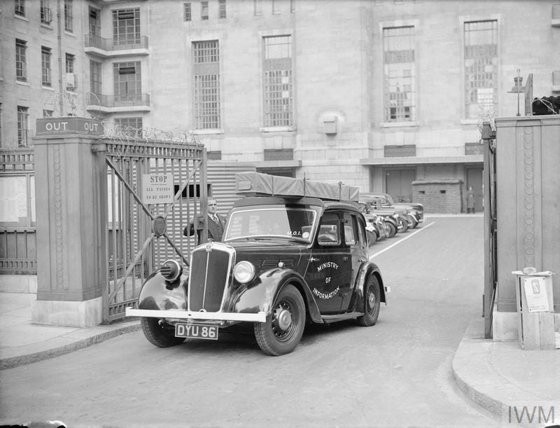
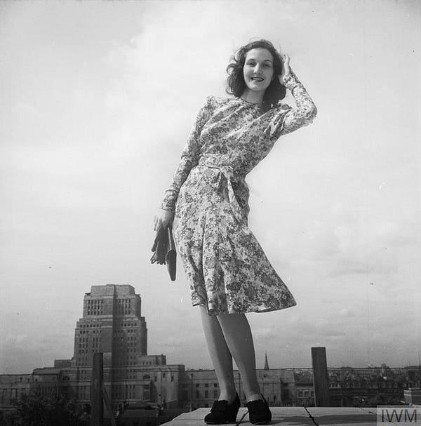
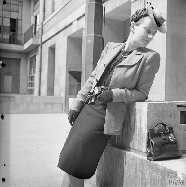
As I would discover in this excellent post on the building at A London Inheritance, being the headquarters for the Ministry of Information meant that Senate House also became an unlikely backdrop for various fashion campaigns during the war. The Ministry wanted to show how rationing specifically, and perhaps the broader context of the war more generally, need not stop style, commissioning fashion designer Norman Hartnell to rustle up some outfits—“material being available for seven clothing coupons.” (Individuals were allocated 48 clothing coupons per year during the war.)
Finally, in order to put a particularly virulent rumour to rest, Senate House was almost certainly not Hitler’s choice for a London headquarters. The lazy elision of modernist architecture with evil will be played out many more times subsequently—perhaps best in Los Angeles Plays Itself, with its incredible array of villains’ modernist domiciles—yet it is perhaps no surprise that the more reactionary elements of British culture would point to Senate House as a kind of pre-installed Albert Speer, speculating that Luftwaffe bombers spared it accordingly during the Blitz. Where the rumour comes from is hard to track down, but it lives on today (Ed. Some 18 years after writing this, and having become a visiting professor at UCL, I discover some of my UCL colleagues are still repeating the myth!)
(The Guardian’s Simon Jenkins, who we can often file under “reactionary elements of British culture”, repeated the nickname of ‘Hitler’s Headquarters’ for Senate House in this rant about the University of London. He describes the building as “Charles Holden’s Stalinist Senate House”, confusing his dictators somewhat, and complains that the Nazis “sadly did not bomb” the building, before extolling us, in a Charlesian flourish, to finish the job instead.)
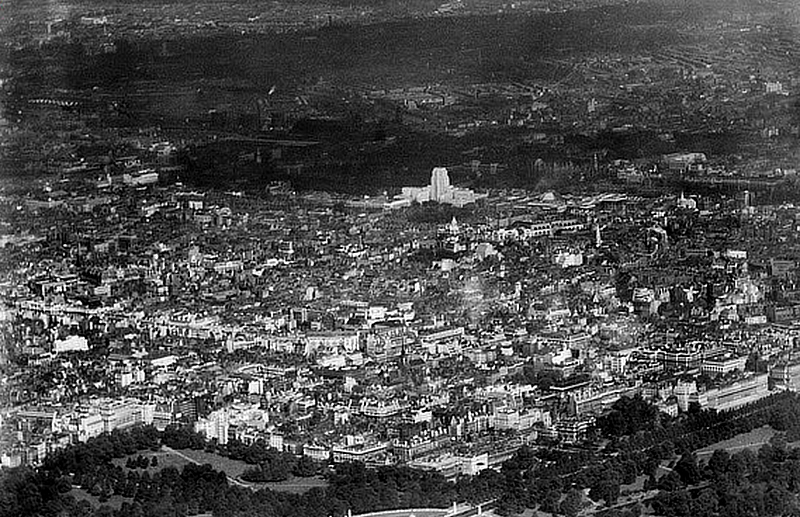
But the rumour is no more than that. As this piece makes clear, the area containing Senate House was in fact heavily bombed by the Luftwaffe.
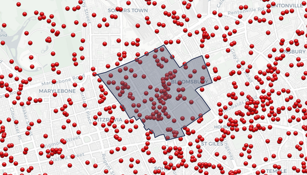
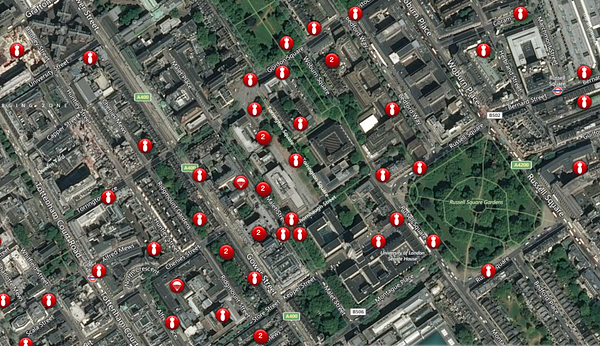
The Bombsight website indicates the strong peppering it took, with over 100 high explosive bombs landing around the building. Much of UCL’s Gower Street campus was bombed, including the Great Hall razed to the ground, and Senate House itself took a direct hit, to the library:
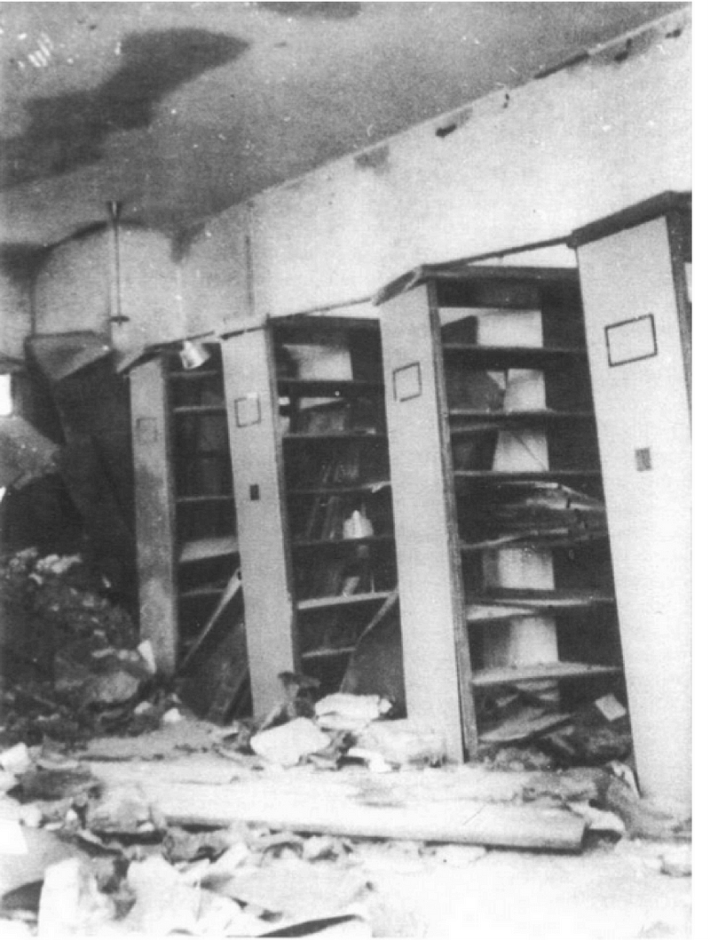
Indeed, on November 7th 1940, another direct hit to Senate House was recorded in the diary of diplomat Harold Nicholson, who staying there at the time:
“Splaaassh! Craash! Tinkle! Tinkle! Oh I was no longer in my bed but on the floor. Charles Peake burst in, “Are you alright, Harold?” “Yes”, I said. “We’ve had another direct hit: a bad one this time” Well, up I got,…The passage outside was filled with a red fog which was just dust. There were air-raid wardens rushing about in steel helmets. And would you believe it? We really had been struck on the boko by the Luftwaffe… A bomb had hit us on the shoulder. It had broken through one floor and exploded on the floor below.”
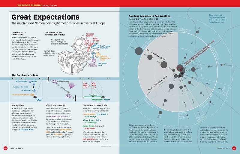
The accuracy of World War II bombers was a long way from precision targeting, as this wonderful diagramming from Max Gadney makes clear. Even with the advanced America bombsights of 1944, only 30% of bombs fell with 1000 ft of target. That was in good visibility.
Today, we’re accustomed to watching real-time footage of on-drone cameras almost knocking on the door of a specific building before entering. But it would have been very different on a cold, wet 1940 – in fact, London’s wettest and most cyclonic November on record.
There is simply no way that a squadron of Heinkels and Junkers, way up above London, immersed in filthy black clouds and relentless ack-ack fire, could have aimed for an area to be bombed, somehow spared a specific building within it. Hitting central London itself would’ve been a big enough challenge.
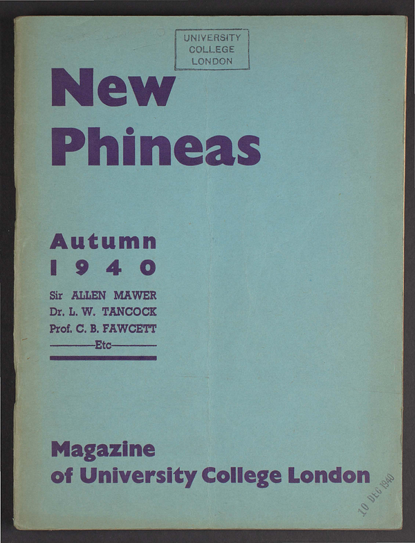
(Ed. Years later, using excellent digitised assets from the UCL library, I also found reference in the old student union paper—New Phineas, Autumn 1940—to the heavier hits that the UCL Great Hall at Gower Street. The university staff and activities had been evacuated from London and was distributed around the country. You can almost hear the loss in their voices in these editorials.)
Nonetheless, these myths and literary allusions add to the rich stew around the building, aligning it with a form of centralised opaque and abstracted state control. Yet the deeper psychogeographical loam within Bloomsbury points to a rich heritage as a place for a very different kind of political agitation, albeit of a distinctly dusty literary nature. Each year, various Marxist conferences are held at Senate House, bearded gentlemen of a certain age wandering around the surrounding streets. And as I type today, I can see the start of the anti-Bush protest, setting off from Malet Street, directly in front of Senate House.
The pre-eminent critic of British architecture at the time, Niklas Pevsner, wasn’t sure about Senate House at all, calling it “undecided modernism” and “strangely semi-traditional”—basically saying it’s not as good as his earlier stuff.
The key London architecture document of later years, Nairn’s London (1966), by Ian Nairn would also have an oblique swipe at it, noting “As anything more than an area on a map, Bloomsbury is dead. Town planners and London University have killed it between them — a notably academic victory … If this is progress, then I am a total abstainer.”
So, undecided or balanced, progressive or traditional? Either way, Holden’s classical allusions were surely part of the brief for a building so redolent of traditional learning and Empire. He was no doubt pulled backwards by the sheer weight of that sensibility, and yet the building also clearly yearns forward too, stretching upwards into the bright hope of a more progressive 20th century.
Perhaps this is a question of timing. Emerging in early 1930s, but planned since the late 1920s, Senate House is well beyond the turn of the century, yet still not fully part of its own time. Perhaps it is an archetypal XX20s-XX30s building? It is not yet Highpoint, but nor is it the Houses of Parliament.
A design brief moving backwards and forwards simultaneously suggests a very difficult compromise, but as I sit gazing out at the impassive alabaster monolith still standing guard over Bloomsbury’s intellectual heritage almost a century later, Senate House feels like a most successful compromise indeed.
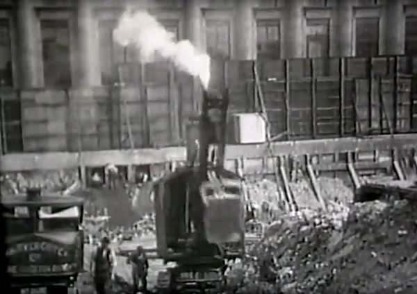
Ed. Years later I would discover a documentary film about the design and construction of Senate House, featuring much footage of its initial construction, which is well worth watching:

Ed. Some months after posting this, I described further layers of mythology being laid down at Senate House, as the building became a stand-in for the fictional Gotham City police headquarters, as the film Batman Begins was being shot outside my window.
Ed. This piece was first published at cityofsound.com on 21 November 2003.


Leave a comment