With brief nod to the avant-garde (aka Grazia, Heat and The Sun)
Ed. This piece was first published at cityofsound.com on September 12, 2005, when The Guardian redesigned into ‘Berliner’ format, a redesign that was ultimately seen to be highly successful. Today, 15 January 2018, it redesigned again, to tabloid format, and I discuss some of the issues of tabloids, berliners and broadsheets below. I was working at the BBC at the time, and my reflections on design processes within media organisations are much informed by that context. Sadly, it looks like The Guardian committed a cardinal sin somewhere along the way, as many of the links to their Editor’s Blog have broken. I’ll update them if I find them. Had I known, I would’ve picked that up at the time, even though a website redesign was some way off for them, as I was helping lead a project to prevent exactly that at the BBC, for iPlayer and other platforms.
Anyway, back in 2005…
It’s a fascinating experience (and what we would previously have thought of as an immense privilege) to be watching the Editor’s Blog at The Guardian newspaper as their newly designed newspaper rolls off the presses in London, Manchester and around the world. Victor Keegan and Emily Bell (and others) have provided an insightful reportage throughout the process, a more vivid, characterful reflection on the redesign than the official, published versions. (Just as the web should be at this point, perhaps?) The adrenaline of the redesign is familiar, as is the inexorable, anticlimactic drift to the pub afterwards as staff nervously await the reaction — experience suggests that as long as half the comments are not negative, it’ll be accepted and even loved in time.

The culmination of what feels like an inordinately long and public design process, though apparently rapid for the newspaper world, the switch to the ‘Berliner’-size format may not quite be make or break for The Guardian, despite the 27-year low circulation in August. The Guardian is a powerful brand and its website continues to perform well, if not profitably, creating a new global readership with an increasingly distinctive, ‘progressive liberal’ news and comment agenda.
But it is a huge gamble none the less; some may see it as simply following suit after The Independent and The Times shrunk; others will see the desire to not copy them exactly in reducing to tabloid size as unnecessary and costly obstinacy. Personally, if the shape signifies anything at all, other than a happy, user-tested functionality, it signifies a shared sensibility with the European press, at least superficially — it’s now the same size as the Barcelona’s La Vanguardia and Rome’s La Repubblica, Le Monde and Die Neue Zürcher Zeitung. As the city of Manchester sees its partners as mid-sized European cities once again, rather than London, it’s fitting that its paper does too, and for those of us who consider themselves British and European in roughly equal measure, it’s likely to provide a happy, implicit consonence. As Richard Hollis points out, format and physical presence does mean something.
The paper’s own articles — and an almost-snarky piece by Frank Kane in sister paper The Observer (Oh the joys of working with multiple brands within one stable!) — pore over the details of the redesign with some depth, so I’ll carry on with the subjective opinions.
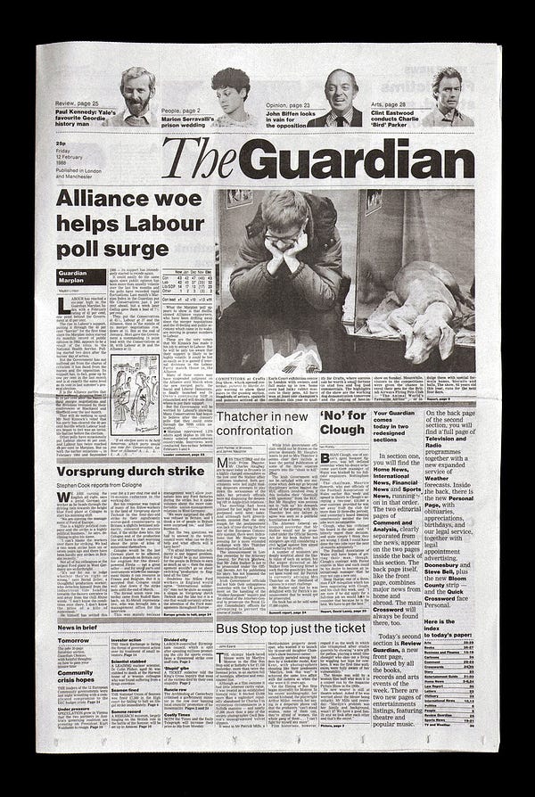
The all-important front page actually looks pretty bloody good, with some really nice navigational touches and bold layout (which I’ve annotated on this Flickr pic, including some notes on visual design). We’ll assess the rest when it’s in our hands tomorrow morning, with an espresso for company, but we can assess a fair bit from the lavish attention The Guardian and Observer have paid the redesign. The Editor’s Blog has been refreshingly open and honest throughout, which is a real tribute to the paper. You get the feeling there’s little they’re holding back. For example, earlier this evening, features editor Ian Katz wrote:
If you’re a design purist don’t look too closely at page 3 of G2 tomorrow — with 10 minutes to go the production editor, Paul Howlett, instructed the chief sub, who had been manfully trying to stretch a piece by Kevin Bacon to fill the required space, to “squeeze the column width”. A year and a half of obsessing over design and it comes to this — if the art director only knew. Fortunately G2’s own art director was too busy to fall off his chair in horror: with 20 minutes to go he was still deliberating over what shade of purple to colour the new G2 logo.
Priceless. Elsewhere, there are notes on the new Guardian Egyptian typeface, by Christian Schwartz and Paul Barnes, which seems to bring it closer to the those used internallly in sections of the Observer and Sunday Independent. There’s certainly a resemblance there, but the designers know that’s only something certain folk will bother with. I like this quote from Barnes: “I want people to feel ‘That’s interesting’ on the first day and by the third be reading the news again.” That’s not leaving traces of The Designer.

While I’ll buy tomorrow’s edition — and having grown up with it, I do occasionally still buy a copy, if I have a day off or it’s the day after a 7/7, 9/11 or even 25/5 — the website has been more important for me than the paper for the last four years or so. I can’t quite believe the redesign will change that, but let’s see. I know that when I read the paper, I read more Guardian than I do in reading the web version. But my life/work-style doesn’t provide the opportunity for the paper at the moment, and so it’s a shame to hear Emily Bell report that the Guardian Unlimited websites aren’t changing, for now.
Obviously over time it is our intention to make the paper and the web as mutually supportive and reflective as possible, and all the paper’s new content and sections can be found on the site. However GU’s design will be staying as it is for the moment. [Emily Bell, Editor-in-chief, Guardian Unlimited]
As a regular user as well as a professional, I’d suggest it is in need of a complete overhaul — despite it being one of the best newspaper sites out there — both in terms of visual layer/interaction design but also the information architecture (it’s unnecessarily difficult to regularly follow the writing of, or link to, favourite columnists, to pick one example). But I also know that marshalling stakeholders and staff to gird loins for such a hefty job is not easy. And there’s a lot that’s right about the current site — and one certainly wouldn’t want to end up with the atrocious piece of work that is The Independent’s latest site redesign. But they’ve got some good people at The Guardian, and I’m sure they’ll get to it. Whilst redesigning the site and the paper in one go might’ve been a ‘boil the oceans’-style grand projet, I can’t help thinking it’s a missed opportunity. Not necessarily in terms of exploiting new technology — judging by the Editor’s blog pics, the printing presses are new but those old Macs aren’t — but in terms of shared marketing and tightened strategic focus.
However, alongside some vaguely hand-wavy gestures in terms of updating the site in reflection of the ‘Berliner’ redesign, they have taken the opportunity to introduce a potentially fascinating new section, comprising interactive city guides and called Been There (though I’m not sure about the brand extension there?). I’ve long wanted to do a ‘proper’ interactive city guide site on the web, and while this is a decent stab, this still ain’t it. How about something which combines the sheer chutzpah of the Wallpaper* city guides with regularly updated, quality editorial spinning off the open emergent content provided via a community of Guardian readers using tools familiar from all your favourite social software products? Again, this ain’t it.
And yet, Been There looks like it’s going to be making good use of The Guardian’s implicit strength — its journalists. For example, Gary Younge on New York, whose ‘top-down’ expertise is vital in an enterprise such as this. There are tags as a way of marking up notes (of course!) and some usefully open ways to contribute content. However, there’s a bunch of problems which may hold back Been There initially. For instance, and at first glance, the inability to add comments to notes (say I wanted to comment on Younge’s notes on Auster’s New York Trilogy? I can’t); the lack of URIs for said notes (say I wanted to point you at the aforementioned note on Auster? Again, currently I can’t); no maps, or links to maps (could they have used a combination of the Google API/Flickr API to pull in both maps and photos? Perhaps commercial/rights considerations make that problematic); how about a nice printable PDF version for in-city back-pocketting?; some basic interaction design problems (buttons which don’t look like buttons etc etc). Additionally, the design does little to give a sense of the vibrancy of the content we’re dealing with here. Still, proof of the pudding etc etc, and I’ll check it out how it works for upcoming city trips. There’s not much alternative. So … close but no Havana. We’ll be watching forthcoming additions to Guardian Unlimited with interest.
Back to the thing you can wrap your chips in, there’s also a Flash-based extravaganza featuring video interviews with the protagonists, including creative editor Mark Porter talking through the principle design challenges. Those who’ve designed for the web may want to unfurl a wry grin at the following insight from Porter — it reveals a really interesting and obvious parallel between web design and newspaper design:
Designing a newspaper is rather different from designing most other things, in that the designer doesn’t have final control over how it’s going to look. It’s really about creating a kit of parts, which is going to be handed over to the journalists who create the paper every day, and that kit has to be almost infinitely flexible to be able to deal with almost any situation. [Mark Porter, Creative Editor, The Guardian]
Porter notes that they’re dealing with “readers who get most of their news from television and the internet now” and without the hours to spend reading the paper that people used to have. He can’t assume that people are going to read the whole thing — so there are navigational cues, layout guides, and other devices to alert the reader to other articles of interest within the paper (and presumably online) — almost, “if you like this article, you’ll also like this one on page 14”.
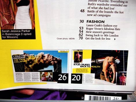
I’ll look forward to seeing how these work in practice. I’m quite a fan of two devices used in the hugely popular Grazia magazine and hugely populist Heat magazine. Now apparently the biggest selling ‘glossy’ in the UK and rather beautifully laid-out, Grazia deploys the thumbnail preview of features on their contents page (see below), providing both a hint of the spatially classy layouts the magazine is developing as well as visually lodging a cue for subsequent reveal. (Five years ago, I tried something similar with the bottom of page section-navigation on the late ‘motion’ site.)
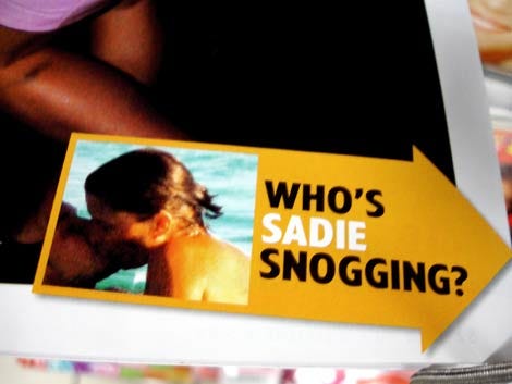

Great use of yellow, too. Heat deploys one of the more compelling bits of in-magazine navigation around (see snaps of the bottom of Heat pages below), indicating what’s to follow if you just turn that page. Quite brilliant. Absolutely one of the best bits of ‘navigation’ I’ve seen all year. Now that’s a navigational hook. I’m not sure what the interaction design pattern name for this might be, however. Any suggestions, decent or indecent? Something involving ‘cheeky’, ‘pull’, ‘arrow’ and ‘crop’, perhaps.
These last examples are from a press apparently closer to the tabloids, and yet deploy design techniques which are both functional and engaging. The new Guardian is apparently an attempt to articulate a different paper altogether however, and Mark Porter suggests that one of his guiding principles is in response to the sheer noise of the marketplace: “If everyone else is shouting louder and louder, the only way you can be heard is by talking in a normal tone of voice — or even whispering.”
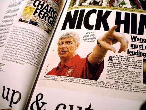
That last comment provides an interesting juxtaposition with Will Hoon’s article in the latest Eye magazine (“Close up and cut out”, Will Hoon, Eye #57) on the design tropes of the back pages of the ‘red tops’, or tabloid press, here in the UK.
In particular, the coverage of Britain’s national game: football. This is where the shouting is at its loudest, but in some ways the design response is entirely in tune with the content. Hoon makes a strong case for a sophisticated design strategy which is “at its best, a vibrant and riotous assemblage of colour, image and word”.
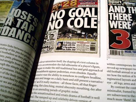
In sharp contrast to The Guardian’s carefully mannered modern sensibilities, Hoon describes a world drawing directly from punk and football fanzine culture of the late-70s/early-80s. Multiply this with the frenzied, consumption-fuelled world of contemporary football — all “roastings, feuds and exclusives” according to Hoon, who’s worked in the field — and then again by image library/photo manipulation software, and design’s response has been invent an entirely new visual language, miles away from realism and sober reportage.
The suggestion of action, an almost implicit violence (from the predominance of red, white and black within the colour palette), the urgent screaming demands for attention, the skewed language of the headline, the bold burning out of peripheral photographic information, the flash of brand logo, the eye-wobbling clash of contrasting, brightly coloured strips, the colour saturation itself, the shaping of a text column in order to accommodate the full silhouette of a player’s figure, all began to make the traditional box and grid approach of the broadsheets appear pedestrian, even obsolete. Equally impressive was the ability to somehow re-configure headline, column and image on a daily basis and still present a narrative/’story’ as if it really matters — all those faces, all that finger-pointing, fist-clenching, muted obscenity mouthing, day after day in an unending parade of graphic noise.
It’s a great article, describing a highly creative design culture. I am in no way suggesting that such approaches would be appropriate for The Guardian — nor indeed the Heat/Grazia navigation above — but it’s worth contextualising the inevitable, quite worthy focus on The Guardian over the next few days. This is hardly a rigorous examination of the field, nor am I particularly qualified to do such a thing in the first place, but for all the modernist sensibilities being tweaked by The Guardian’s redesign, it’s worth considering other design approaches across a range of publications and audiences, and asking — to trot out a football cliché — at the end of the day, right now, exactly which are the more avant-garde, adventurous design techniques?
It might be unpalatable to some that a Guardian redesign that has been approached with clear intelligence, skill, focus and grace might seem out of step with the times, but it’s the chaotic, noisy people of these times, as well as the readers of The Times, that The Guardian is going after. Read The Economist recently on the scale of the hugely-influential celebrity-orientated newspaper and magazine market in the UK. It’ll be interesting to see if, as Porter suggests, the Guardian’s G2 ‘daily magazine’ can provide the panache and wit of the magazine format, appealing somewhat to this sector, from within the “roughness” of the newspaper format. A newspaper designer of the early 20th century, with a modernist bent perhaps, might recognise this new Guardian redesign as one of their own, and describe the shrieking back pages of the ‘red tops’ as the more radical offering.
But perhaps there is another radical goal which the paper could take on without pursuing the tabloids or glossies; an alternative redesign conspicuous by its absence: that is to create a new aesthetic, architecture and interaction design solution to match the “authoritative and intelligent” format that Porter describes the ‘Berliner’ as, and that editor Rusbringer seems to want to lead the main section of the paper after — a “more measured”, progressive liberal news and comment voice on a global scale. If that was the goal, perhaps The Guardian has not nailed its colours to the mast enough.
In this sense, the redesign feels caught somewhat between the celeb-fuelled world of the weekly glossies and the clean, stately repose of the European newspaper. If it’s the former they’re after, again, I’d suggest there’s a few, cleverly appealing design cues in Grazia, Heat and the tabloids they’d be looking at; but ultimately that doesn’t feel to match their brand, apparent mission, and certainly the values of the paper. I’d rather they’d taken on a reinvention of the latter — to create that new sense of what a newspaper could be, could feel like, look like. That would include properly taking and integrating the website and other media, given that’s where people increasingly consume news. So whither the serious newspaper? I think may be an answer there, in actually pursuing the stated aims of this redesign more than the end result would suggest — it’s a more difficult task, but the results could be potentially more distinctive in a crowded, shrinking market.
With the benefit of immense experience, former editor Peter Preston notes that we’ll see whether it’s worked in about 18 months or so. But for now, a generous tip of the hat to a job well done which, whether it’s the right strategy or not, appears to articulate all of CP Scott’s values for the paper: “Honesty, cleanness [integrity], courage, fairness, a sense of duty to the reader and the community”. Given that delicate tightrope-walking act I just hinted at, and given the technical innovation and courage required to completely reinvent their printing process as well as spruce up every aspect of the paper itself, all involved deserve immense credit.
Ed. This piece was first published at cityofsound.com on September 12, 2005.


Leave a comment