A brief review of the Ray and Maria Stata Center, the new home of the various computer science and engineering faculties at MIT, designed by Gehry Partners.
Ed. This piece was originally published at cityofsound.com on October 12th 2004. Apologies for the image quality; it's a 2004-era digital camera (a Canon Digital IXUS 400!)
I visited this building during the nearby conference, Designing Interactive Systems 2004, at MIT, this August 2004. Yet I wrote about the Ray and Maria Stata Center before seeing it, which was always going to be a risky thing to do.
On the basis of this single visit, however, I do feel partly vindicated in raising a few question marks, even from that distance. But it’s also clear that the Stata Center will succeed both as the kind of landmark piece of celebrity architecture that cultural institutions and cities increasingly define themselves with, and as an exciting and engaging working building for the staff and students at MIT.
My concerns lie in its ability to adapt, and from my uninformed observations about some of the ‘finishing’, both in terms of build quality and final implementation. I also found the building difficult to read; to justify the extravagently lyrical structure with some kind of meaningful intellectual, cultural or historical backdrop.
It’s sharply different in this respect to the Gehry’s Guggenheim Bilbao, which to me, as mentioned previously, is a successful building, in terms of integration into the city — roads running through the building, the Guggenheim folds itself around the streets — and in terms of the form having meaning, echoing the billowing sails and lurching bows of the ships upon which Bilbao was built.
Here however, the Stata doesn’t seem to have any obvious historical references to draw from. Perhaps this is a problem with Cambridge, where history is loose and slippery, or as a slave to repeated functionally-oriented reinvention.
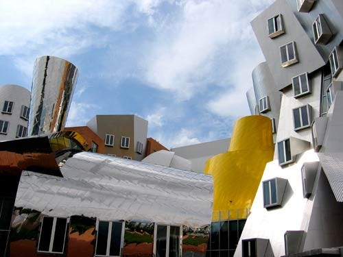
One could imagine it’s drawing from an archetypal American office block form welded to urban low-road architecture of corrugated iron sheds and MIT-specific radiation-blocking metal boxes and then that it had all been melted together, in some kind of freak on-site scientific experiment accident, unleashing insanely high-temperatures and then equally insanely rapid cooling? I suppose not.
A possible influence might be the ‘ray-tracing aesthetic’ of computer graphics — William Mitchell of MIT certainly thinks this is the case. I suppose that is rooting the building in local meaning, albeit a virtual local. Phew.
Either way, Gehry’s buildings are interesting; they provoke a reaction; they are increasingly wonders of the modern world, pilgrimages for architecture geeks. Indeed, there are views of the building which literally draw gasps from onlookers.

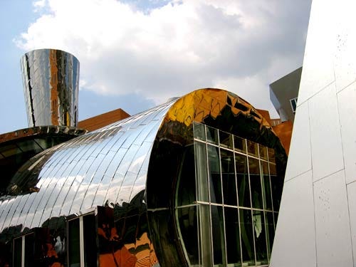
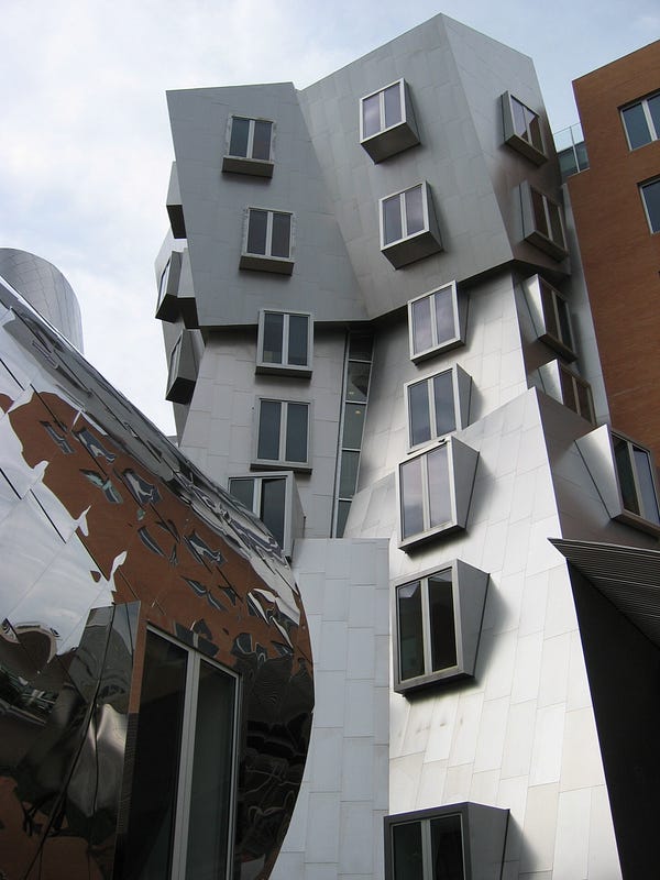
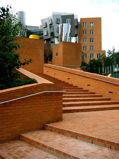
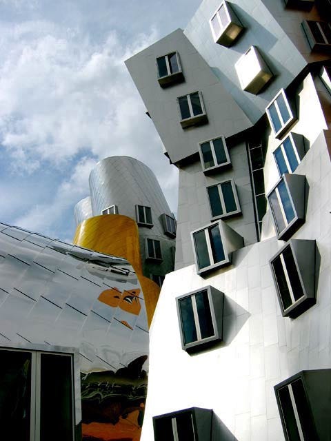
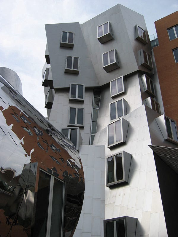
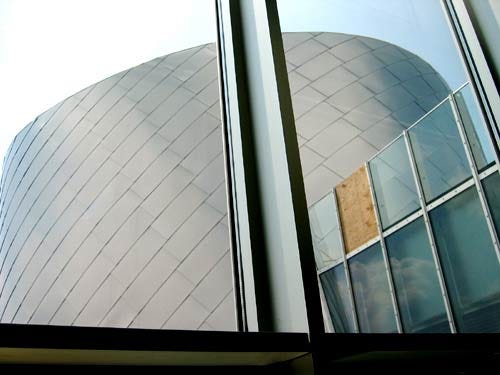
I’ve written previously about whether all these angled, stacked shapes make for effective use of internal space — as have others — so I won’t retread that ground. Caveat invoked, this building possesses a particular brand of beauty from this angle, the glittering Robotics Lab at the base of a mountainous slide of ascending office types.
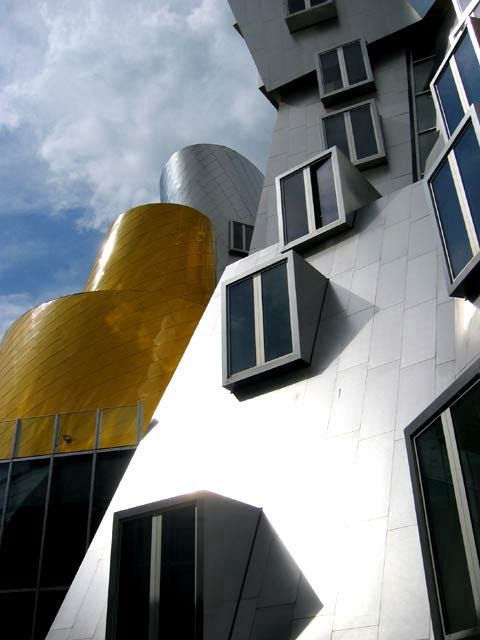
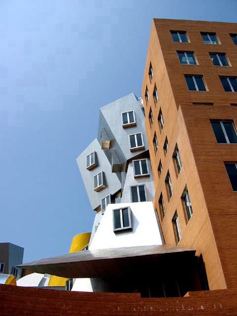
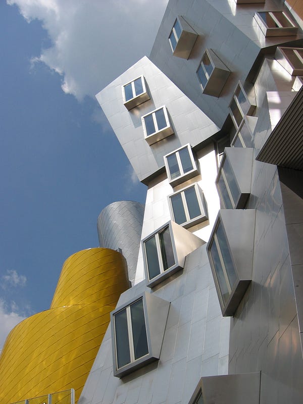
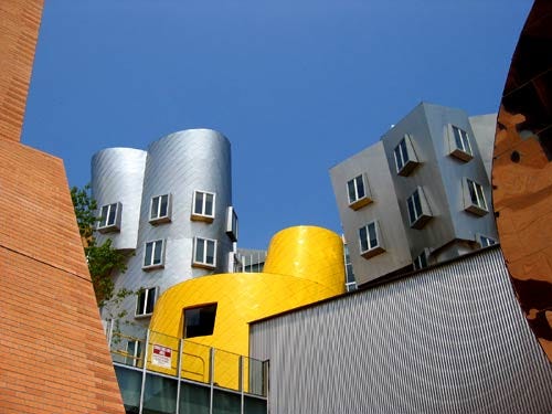
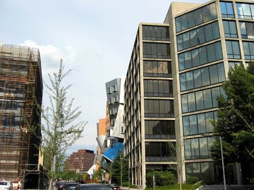
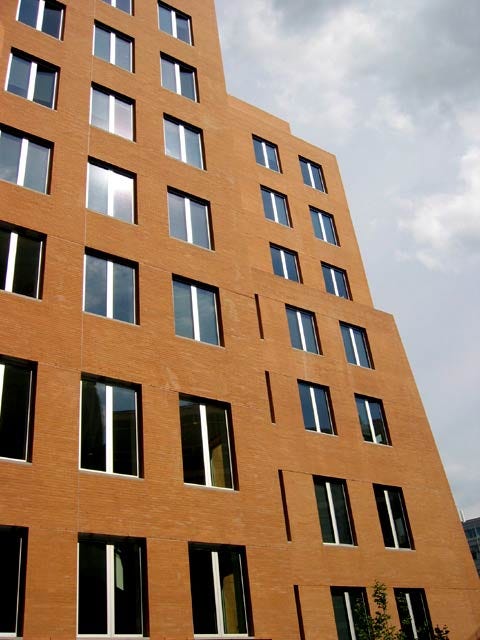
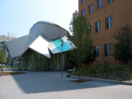
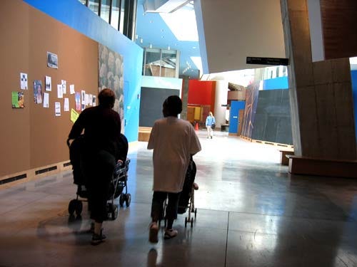
Other views of the building are less appealing. The view from afar is less striking, and the view in the context of the other buildings — the second image viewed from the Vassar Street approach — indicates it’s actually bizarrely discrete, amidst the looming functional architecture surrounding.
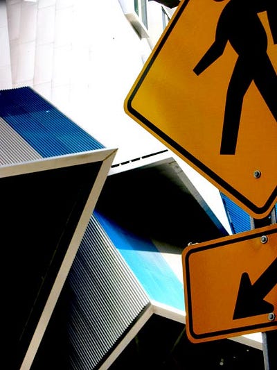
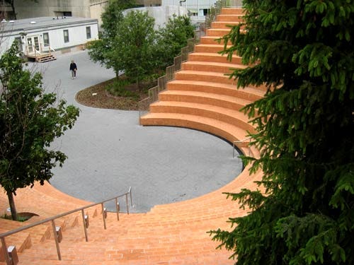
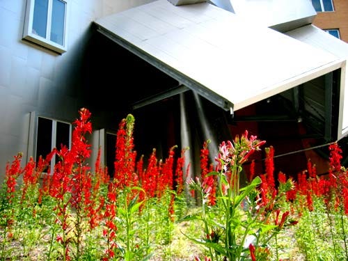
Mitchell jokingly referred to this view as its “sober urban side”. It is more sober, perhaps, but really more functional. Surrounding the building are newly-planted and bleakly sparse flowers and trees familiar to new buildings and science parks the world over. The red flowers work, though. Some passing views of street signage collide gloriously with the insanely angled ramps and roofs of the building. Skirting further around, there’s an odd miniature amphitheatre leading up to the Robotics Lab and ‘mountainside’. Mitchell claimed that this is where “the revolutions will start”— it feels way too manicured for that.
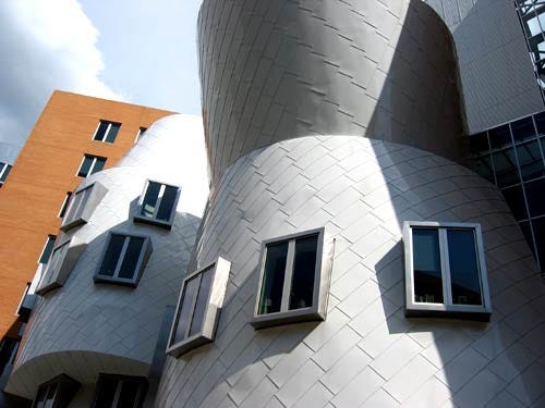
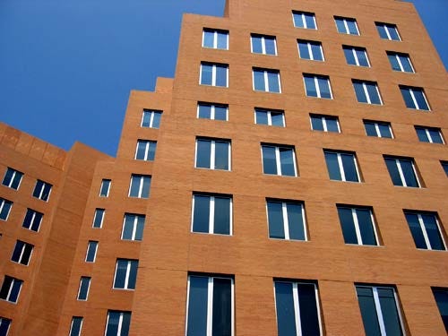
Further round the back, from one quarter-view, it almost looks like a standard office block. This is a classic Gehry ‘trick’, and often a strong one I think i.e. build in a very conventional rectangular space, as in the Guggenheim Bilbao’s principal gallery spaces. I use the word ‘trick’ deliberately as, for all the show of the front, some may consider this view a let-down. I imagine it’s a practical compromise to the requirements of office space and budget.
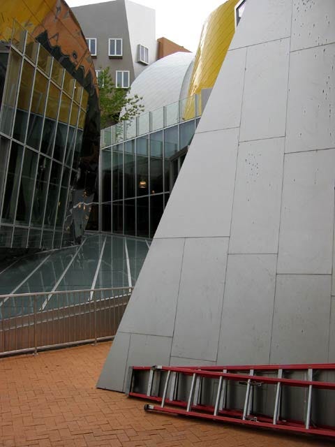
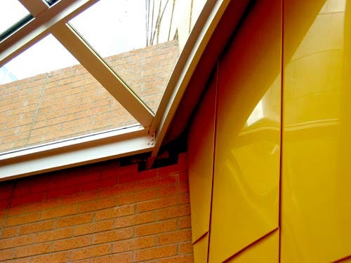
However, the ‘street-level’ railings surrounding the various glass roofs are a rather inelegant solution I thought — as with the Corbusier ramp at Harvard’s Cambridge Center mentioned previously, I can’t believe this was in the original sketches. I can’t believe they were even in the CAD-generated engineering drawings. They look bolted on as an afterthought.
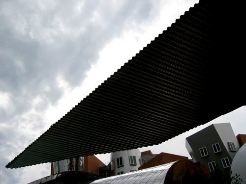
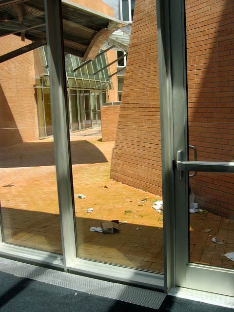
The various entrances to the Stata Center are a little odd. They’re not particularly inviting. It is possible to walk right in off the street, however the sheets of corrugated iron angled down over the doors — like hooded eyelids, gathered ankle-length skirts or simply a tin hut’s sharp-edged overhang — don’t exactly draw you in. I’m wondering if there was a chance here to make MIT a little more transparent — to do what I indicated John Maeda had told me earlier that week — to increasingly open up and communicate the fine work that goes on here. A missed opportunity?
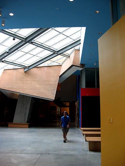
Heading inside the building, I got an unrealistic sensation of quietness, and light, airy spaces, due to the absence of students (it was the summer vacation). But there are some extraordinary spaces inside, no doubt.
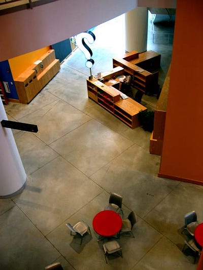
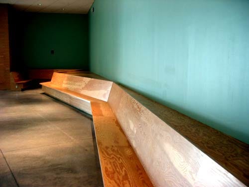
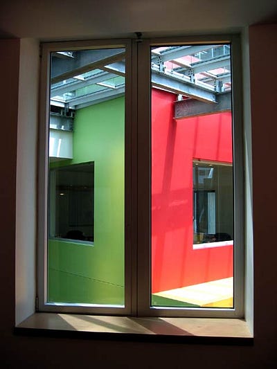
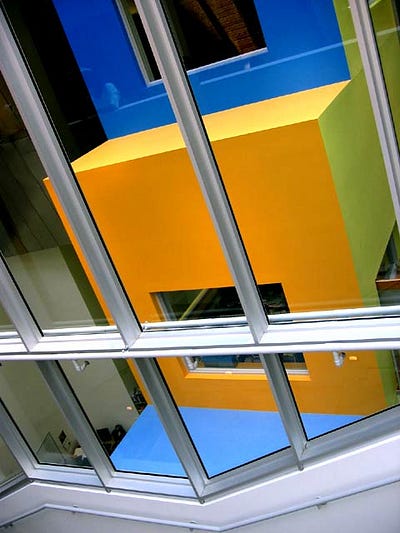
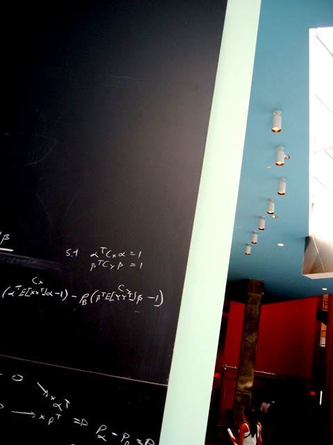
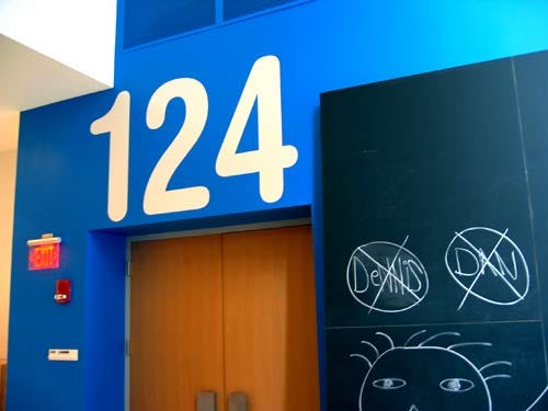
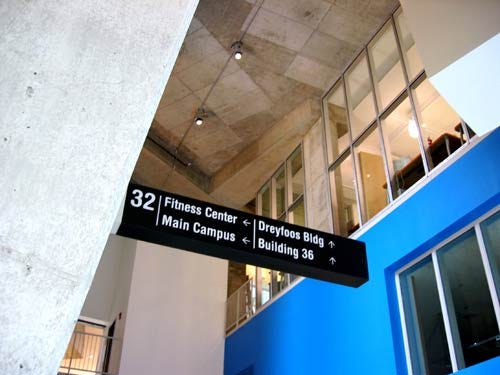
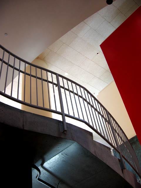
The most interesting space of all, perhaps, is the “infinite corridor” idea, which runs through the building, curving like a river in and around the irregular space plan. It features high ceilings, wide open spaces, nooks and crannies, bench-like seating, eddies and curved flows, walls covered with chalkboards and imagery, variegated widths, twists, turns and deliberate dead-ends — all designed specifically to increase social interaction amongst the technical community which will inhabit the building. In theory, it’ll be home to vending machines, cafes and shops — in an attempt to conjure a kind of street life.
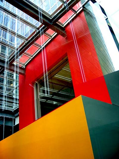
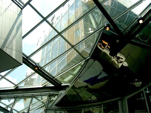
Sections of the corridor have glass roofs; other sections vaulting ceilings; other sections insane cross-sections of both. Interior spaces are generally bright and colourful — though occasionally featuring some rather poor choices of stock photography, blown up to immense proportion i.e. nice ‘Africans’ smiling and waving, a few colourful boats from the ‘Developing world’, and so on. In general though, it was easy to imagine this space working, and working well.
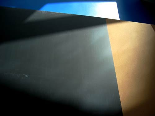
Due to the numerous light sources available in such an unconventional building, light falls on the coloured walls and chalkboards to create gorgeous patterns.
The chalkboards provide space for random attacks of theory, practical or idle.

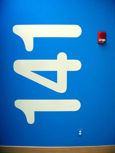
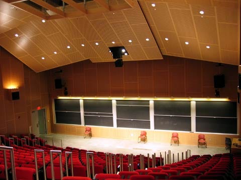
Nice big type sharply leads students and staff into the lecture rooms. And the lecture rooms and classrooms I peeked in did seem impressively specified. (And yes, there seemed to be enough plug-points and ethernet connections.)

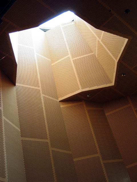
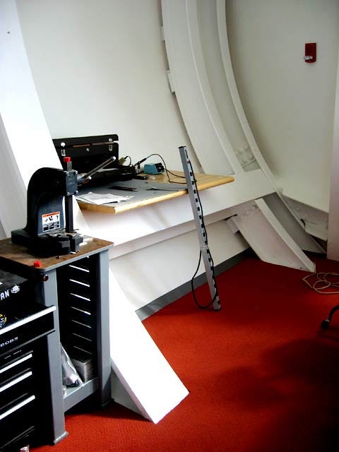
With so much of the interior trapped in the riot of cross-sections, glass and steel intercutting and weaving bold swerves through one another, you’re often left looking up through glass as the building’s canyons rise and fall around you. One inhabitant wondered what’s going to happen when these glass cube corridors are covered in snow, however, which is all too likely given the harsh Massachusetts winters. It’s not going to be easy to take a broom to these spaces.
Equally, some of the folds and cuts in a building like this will mean that a windy city — hello Cambridge! — has just been offered some new nooks and crannies to shove litter into. They were already gathering in the kind of annoyingly inaccessible spaces that someone’s going to have to invent a whole new kind of cleaning device for (at least this is the right building for that kind of invention—as long as its robotic.) Back to the Vassar Street side, just by the entrances descending under the building for deliveries and cars, and the building is already dented. This isn’t the kind of panel I imagine you can just beat out at the local car-dealership.

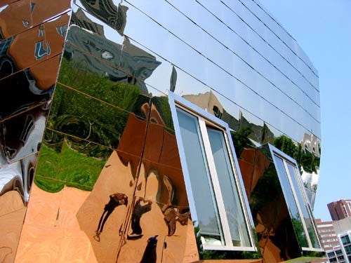
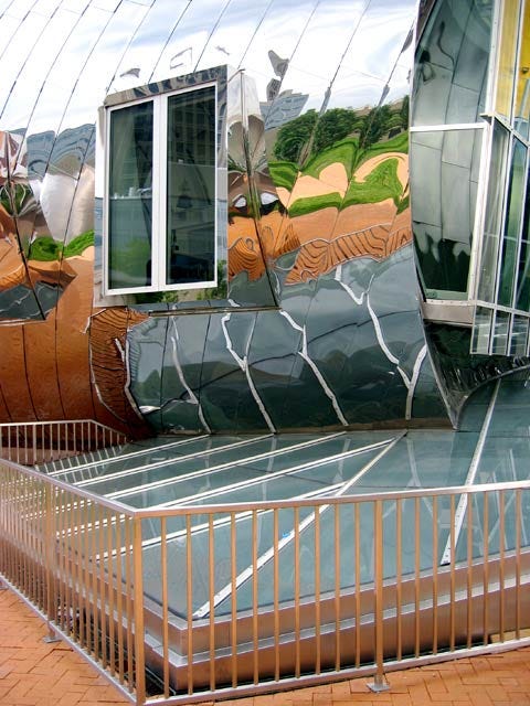
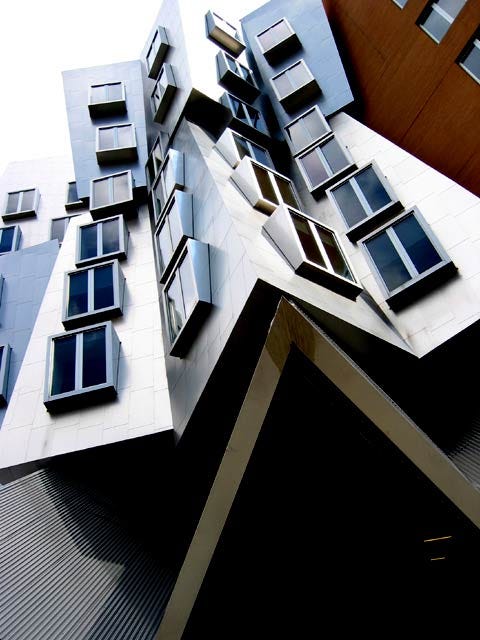
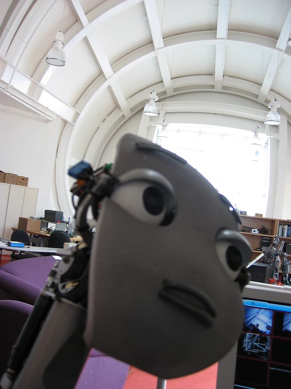
The Robotics Lab is undoubtedly one of the stars of the show. A highly mirrored tube from the outside, the interior provides a light, open space for some of the more interesting work going on at the Stata. Inside, the high ceiling and clear space above provides some sort of counterbalance to the chaos of wires, motors, textbooks and other robotically-related kipple slowly accreting below.


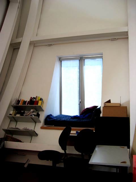
I liked the way that researchers are adopting the space: check the informal bed/hammock wedged into the deep window sill. Or the angled shelving attached to the curving wall, which is surprisingly easy to get books from — I tested it!
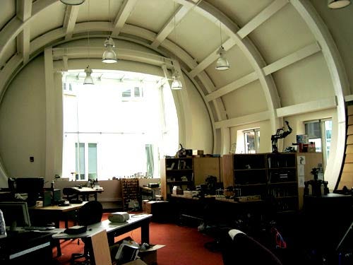
One researcher told me they much preferred the increased space the new building afforded them; another said that the use of that space wasn’t all it could be though, given the cylindrical form colliding with the practicalities of rectangular furniture.
But just having more space won out overall. It was very light, perhaps given the amount of rays bouncing around the complex mirror surfaces surrounding the Lab. As noted previously, William Mitchell’s opening keynote at DIS2004 indicated how he thought the building had been clearly influenced by the ‘ray-tracing aesthetic’ of computer graphics.
Allegedly, though, it leaks. Walking around, I spotted the odd bucket and mop, and one of the inhabitants mentioned that it had already leaked several times. There are those who allege that’s what you get with Gehry building, which seems a bit much. And then this kind of thing happens:
“The damage seemed pretty extensive, but I have no conception of what it takes to repair slabs of sheet rock that meet at a 124° angle constrained to a circle that intersecting a glass roof. Something tells me the materials are cheap but the rocket scientists who install it are expensive.”
As a long-time opponent of ‘these kinds of buildings’ — particularly at MIT, given his appreciation of Stata’s predecessor, Building 20, in How Buildings Learn — Stewart Brand would be up in arms at this point, no doubt talking about the basic qualities of architecture in terms of shelter and weatherproofing, never mind the ability of the building to be easily repaired without the aid of “rocket scientists”. In what Brand might see as a cruel irony, some remains of Building 20 are to be found in the middle of Stata.
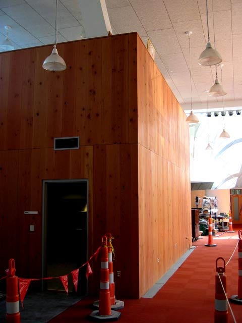
Elsewhere, there’s a few places where the building quality seems to have slipped, with some awkward fixtures and missing pieces. My friend and trained architect Matt Jones, walking around on the Stata tour with me, told me that one of his ex-lecturers called these kind of ‘features’ “Oh Shits”. Rumours that the money ran out remain unconfirmed.
These broken windows and unfinished insertions can be fixed, just as a dent can be knocked out and a roof sealed. It’d take a more thorough and informed crit than I could do to assess whether the building is going to work long-term, or become a steel-plated white elephant.
I must say I was entirely taken with the ‘infinite corridor’ and many of the interior spaces — they just felt good, workable, inspiring spaces—with that delicate balance of knockabout affordances integrated into refined high-quality solidity that I look for in buildings like this. Certain aspects of the exterior were simply stunning, for all their rootless showy flamboyance. Elsewhere, doubts remain as to its basic performance as a building in a demanding academic environment, and particularly housing a series of disciplines that are predicated on constant invention. Leaks and electronics do not go well together. Flexible space is at a premium in high technology situations. Students are messy. Experimentation requires a certain devil-may-care approach to the space around you.
Two phrases from Concerning Archigram, which actually relate to a celebration of the kind of “urban disorder” which the infinite corridor seeks to suck some juice from: “irreverent play” and “messy vitality”. Can the building handle this?
I’m still left unsure about the building’s ability to be as adaptive as those it replaces, though I’m all too aware that the funding patterns underpinning this kind of venture mean that functionality must be played off against the building’s apparent ‘iconic’ status. (MIT happen to have chosen the architect that produced the Guggenheim Effect, after all.) The building’s value on the MIT real estate asset books, as well as the brand value it generates for the college, will be considered to be significant. This ought to less relevant than making a functioning, generative and adaptive building for staff and students—but it may not be.
So, just as I closed my previous piece on Stata, only time will tell whether this building is going to really work—in whatever version of the ‘long-term’ that matters these days.
Ed. This piece was originally published at cityofsound.com on October 12th 2004. Do read the related piece, Designing adaptability into MIT: Building 20, Frank Gehry, and knocking walls through.

Leave a comment