MIT Building 20, Frank Gehry, and knocking walls through
Ed. This piece was originally published at cityofsound.com on June 22nd 2004.
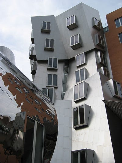
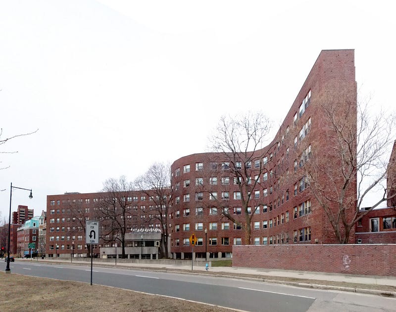
In its latest issue, Icon swoons over the new Stata building at MIT, by Frank Gehry, in common with Wired magazine dubbing it the “geek palace”. Given the pictures, it’s not difficult to see why. The new building certainly looks extraordinary, collapsing in on itself in folds and twists which defy the eye.
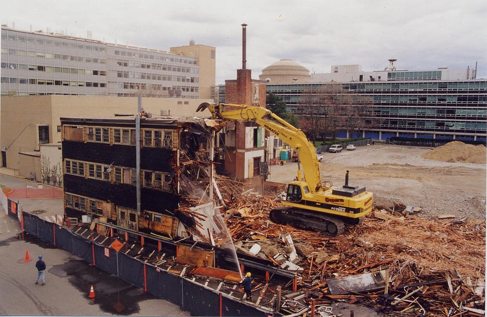
It may be worth pausing to reflect on the buildings it replaces, Building 20 and Tech Square, which I’ll argue were perhaps more usefully in tune with the geekery that Wired covets, and to consider whether Stata will really be the improvement that community really needs.
Caveat: before going further, please note that at time of writing, I haven’t visited the building yet. As I’m attending DIS 2004 in August, I hope to visit then, but at this point, I’m reviewing these media accounts rather than the building. For what it’s worth, the only Gehry building I’ve witnessed first hand at time of writing is his Guggenheim Bilbao, which fits very well into its local environment, both formally and functionally.
Ed. I did manage to visit in 2004. I wrote my reflections here.
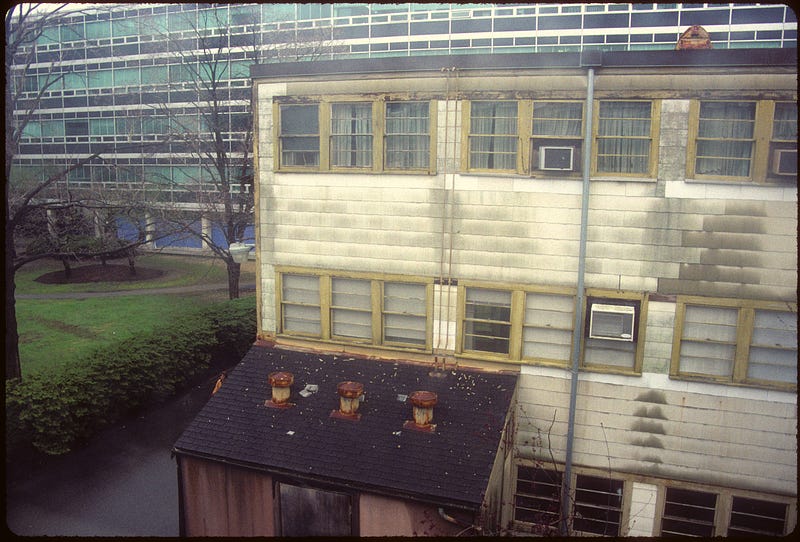
Further complication: Icon suggests that the research building is replacing ‘Building 20’, built in 1943; Wired suggests it is replacing Tech Square, built in 1959. Wired state that Building 20 was demolished in 1998, to make room for Stata. In fact, it’s both: Building 20 made room for Stata; the staff from Tech Square will be the ones moving in. Either way, the characteristics of both Building 20 and Tech Square are being incorporated into Stata.
Wired had this to say about of Tech Square:
“This place is MIT’s scuzzy port on the postindustrial motherboard of eastern Cambridge … nine floors of networking cable and computers piled in sedimentary layers, couches bowed and stained by napping geeks, hallway whiteboards covered in arcana, and vintage machines chugging away in the homegrown programming favorite Lisp … Tech Square, vintage 1959, was the kind of place only a troglodyte could love. Besides perpetually hissing air vents and windows that didn’t open, its cramped floor plan pigeonholed researchers already wary of venturing beyond their own little domains.”
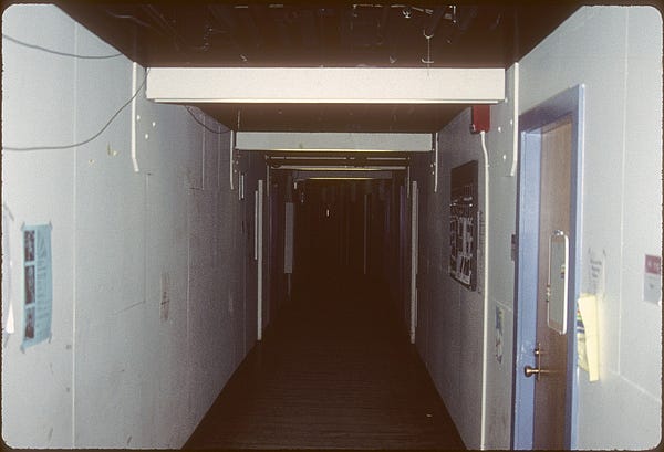
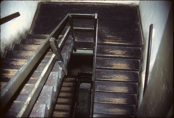
MIT’s Building 20 is the better-known building, as one of the archetypal examples of ‘low road’ architecture detailed in Stewart Brand’s influential book How Buildings Learn — “the most loved and legendary building of all at MIT” according to Brand.
“(A) temporary building left over from World War II without even a name, only a number: Building 20. It is a sprawling 250,00 square foot three-story wood structure — “the only building on campus you can cut with a saw,” says an admirer — constructed hastily in 1943 for the urgent development of radar and almost immediately slated for demolition. When I last saw it in 1993, it was still in use and still slated for demolition. In 1978 The MIT Museum assembled an exhibit to honor the perpetual fruitfulness of Building 20. The press release read:
‘Unusual flexibility made the building ideal for laboratory and experimental space. Made to support heavy loads and of wood construction, it allowed a use of space which accommodated the enlargement of the working environment either horizontally or vertically. Even the roof was used for short-term structures to house equipment and test instruments. Although Building 20 was built with the intention to tear it down after the end of World War II, it has remained these thirty-five years providing a special function and acquiring its own history and anecdotes. Not assigned to any one school, department, or center, it seems to always have had space for the beginning project, the graduate student’s experiment, the interdisciplinary research center.’
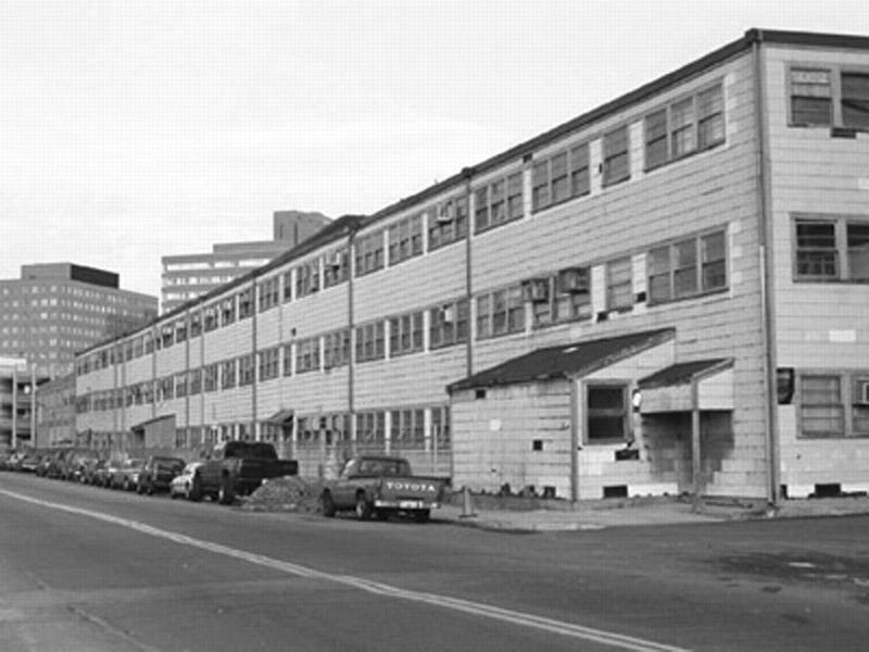
Brand notes some of the inventions and innovations generated at ‘20’ over the years: the science of linguistics, via Noam Chomsky; much of modern communications science, via the Research Laboratory of Electronics; food technology; plenty of nuclear science, acoustics (including Bose speakers); stroboscopic photography; DEC incubated in ‘20’; Timothy Leary painted murals; much of the early 1960s first generation of hackers were based there, at the Tech Model Railroad Club, and so on and so forth.
Brand continues:
“Like most Low Road buildings, Building 20 was too hot in summer, too cold in winter, Spartan in its amenities, often dirty, and implacably ugly. Whatever was the attraction? The organizers of the 1978 exhibit queried alumni … “Windows that open and shut at will of the owner!”; “The ability to personalize your space and shape it to various purposes. It you don’t like a wall, just stick your elbow through it.”; “If you want to bore a hole in the floor to get a little extra vertical space, you do it. You don’t ask. It’s the best experimental building ever built.”; “One never needs to worry about injuring the architectural or artistic value of the environment”; “We feel the space is really ours. We designed it. We run it. The building is full of small microenvironments, each of which is different and each a creative space. Thus the building has a lot of personality.”
That is true essence of geek, right there: “we designed it. We run it”. People could knock it about, drill through it, stick stuff up in it. If the goal really was to produce a “geek palace” with the Stata, I wonder if the new building has the apparently geek-friendly characteristics that Building 20 had?
Brand again:
“Temporary buildings are thrown up quickly and roughly to house temporary projects. Those projects move on soon enough, but they are immediately supplanted by other temporary projects — of which, it turns out, there is an endless supply. The projects flourish in low-supervision environment, free of turf battles because the turf isn’t worth fighting over. “We did some of our best work in the trailers, didn’t we?” I once heard a Nobel-winning physicist remark. Low Road buildings keep being valuable precisely because they are disposable.”
“Building 20 raises a question about what are the real amenities. Smart people gave up good heating and cooling, carpeted hallways, big windows, nice views, state-of-the-art construction, and pleasant interior design for what? For sash windows, interesting neighbours, strong floors, and freedom.”
MIT commissioned Stata to introduce an interdisciplinary way of working to their research, building in zones to increase social contact between researchers—despite Brand’s suggestion above that “interesting neighbours” were partly what ‘20’ was already delivering.
However, MIT were seemingly aware of some of the characteristics of Building 20 and Tech Square that ought to be built into Stata. Wired’s article states that the team designing the new building, led by Gehry, attempted to take on these Old Road characteristics into a new building which was anything but.
“The new priorities: light, air, and interesting views, along with the mantra ‘adaptability’. “We were struggling to break through — they just wanted what they had,” Gehry says. “They loved Building 20 because they could beat it up. So I said, ‘How about a building where you feel comfortable banging the walls out, putting up stuff?’ Building 20.1! Well, sort of.’”
“(I)t may be more than a bit Bilbao for some of MIT’s engineers, but the interior is hackable, rack-mounted, and user-friendly. It has space for everyone from hardcore theoreticians and linguists to robot-builders. There’s even a special little street for MIT’s infamous food trucks to trundle up and shovel out Chinese and Middle Eastern delights by the pound. As the computer scientists say, this is nontrivial.”
However, perhaps making a building hackable is trivial in a sense — in that Building 20 already was, and without trying. In comparison, it’s already questionable whether Stata is truly hackable, according to Wired:
“(T)here’s still plenty about the building that puts geek teeth on edge — “silly” tilted walls, “wasted” space. It’s a bonfire of rectilinearity.”
However, one of the key features much overlooked in Gehry’s Guggenheim Bilbao is that the building’s interior features several conventional rectangular gallery spaces—simple white boxes—as these are the most suitable for displaying most of the artworks likely to be contained therein. The building’s exoskeleton is so defiantly non-rectangular that this conventional interior is overlooked, forgotten, or sometimes even derided (Overheard: “Ah look he can’t keep up the curves on the inside!”).
Yet it’s a further example of Gehry’s ability to shape an extraordinary building which is nonetheless highly functional. At Stata, there seems to be further evidence of this sensible layering and shaping according to Wired — “The geeks got a high-ceilinged warehouse space on the second and third floors”. The service layer also seems sensibly restrained i.e. “no arrays of sensors or touchscreens in the walls, no biometric infrastructure”, and so on. But there is “ubiquitous wireless and a fiber-optic switching fabric that puts a 10-Gbps network within easy reach of every floor”.
Is this enough, though? Judging purely by the reviews, much of the rest of the building seems anything but ‘built for flexible change’, and there is no indication of exactly how Gehry expects users to “bang the walls out.”
If Gehry’s team had constructed a building with Stata’s appearance and had 10-gbps cabling to every desk and enabled researchers to knock walls through in response to their changing needs, then that would be something. It would be fascinating if they had produced a building where the “interior is hackable, rack-mounted”. There’s certainly not much mention of anything like this at the official MIT ‘evolving campus’ site. It would surely be something which Wired had picked up on. It doesn’t seem to be the case though, as at a basic level Icon note: “the slanted walls make it difficult to pack in computers and desks”, whilst Wired reports that:
“The other great whine is wasted space. The four-story atriums at the bottom of each tower are explained in design specs as accommodating “experiments that require tall spaces, such as those involving remote-control helicopters.” You don’t need a PhD to spot a rationalization. Says a senior programming researcher: “I’ve already got an architect looking at what we might do to fill ours in. … And then there’s the square-corner brigade. As recently as November, with only finish work remaining, one emeritus faculty member informed CSAIL director Brooks that ‘the slanted walls are unacceptable and must change.’”
Compare these ideas and responses to The Smithsons’ attempts to build adaptability into Sheffield University in 1953 — a particular facet of architecture for universities is the ebb and flow of academic life, constantly in flux, restructuring and shifting focus every few years. Hence huge adaptability required. Brand again: “Every university has similar stories. Temporary is permanent, and permanent is temporary. Grand, final-solution buildings obsolesce and have to be torn down because they were too overspecified to their original purpose to adapt easily to anything else.”
Compare also with the textile industry and trade-orientated buildings in industrial and trading cities such as Manchester, Leeds, east London, downtown Manhattan. Their reusability is built on the same principles as Building 20: heavy load-bearing floors (built for textile machinery, in this case) with hugely reusable open space plans inside. First warehouses and textile mills; now lofts and playgrounds for new business.
Brand uses this example of the apparently endless productivity of these old spaces to reinforce one of Jane Jacobs’ key points: that new ideas can’t come from new buildings (The Death and Life of Great American Cities). Yet if, for example, the Smithsons had attempted to design Sheffield University — a defiantly new building — with the characteristics Brand was looking for in old buildings, then perhaps the situation is more subtle than Brand and Jacobs, both conservative in their own way, suggest? One hopes so, as much as it makes good sense to reuse existing built environments, when suitable.
Jacobs’s quote—“Old ideas can sometimes use new buildings. New ideas must use old buildings”—is unusually narrow for her (in line with some critiques of Jacobs around gentrification.) Unlike most of her other brilliant contributions, it is both untrue and unhelpful. Clearly, there is may be a better balance to be struck between the low-road knockabout adaptability of Building 20 (and the qualities of ‘oldness’ that Jacobs would recognise) and the sensibilities that well-crafted, solid and high-quality environments can engender, or indeed cutting edge or avant garde layers of change. The question is how to balance these, not simply to exclude the new (as per Jacobs) or the high-quality (as per Brand.) Even looking at the photos of Building 20 above, the building would clearly be an awful environment for some, as well as a productive one for others. Similarly, ‘geek’ is of course a loaded, narrow definition, and potentially exclusionary of many other different sensibilities (gendered and otherwise.)
In terms of teams, the most creative, generative or productive are the most diverse, rather than narrow or homogenous. A team of geeks is not useful, in this sense. Can the same be said of spaces? A “geek palace”, to quote Wired, is less useful, less meaningful, and less open than a diverse marketplace or a street. Do we need to extend Brand’s thinking about shearing layers—actually borrowed from Frank Duffy—so that it does not simply apply to structural or spatial layers as if objects (structure, space plan, skin etc.) but into the qualities of these things, balancing slower-moving, solid and high-grade environments from looser, faster, possibly cheaper more knockabout elements? This quality, or sensibility, could apply to structure or skin—or indeed software.
There are strong ideas in Gehry’s building, in terms of creating ‘trading zones’ forcing disciplines together (more on this theme in an entry on Richard MacCormac’s new Broadcasting House building) and it’s important to resist forgoing innovation and modernity in new buildings in favour of simply lobbing up portakabins for the sake of ongoing adaptability. Adaptability and modernity needn’t be mutually exclusive, but additive, multiplicative.

It’s worth noting that the other MIT building Brand picks out as “most well-loved” is Alvar Aalto’s Baker House (1949), a modernist building of some distinction, which undercuts the notion that Brand is inherently anti-modernist (though not fully.)
Aalto’s wonderful architecture practiced what might be crudely described as a more organic modernism, and tends to be appreciated wherever it was implemented, not least in this MIT dorm. Baker House has been renovated, but still retains its essential character — “warmly convivial” according to Brand — and socially “porous” according to the faculty housemaster, in a profile of the building at Metropolis magazine in 2003:
“But the real key to the dorm’s success, residents say, is the natural flow of its communal spaces. The single entrance, central dining area, and ample lounge spaces foster a strong sense of community; the dual stairs allow students to circulate vertically as well as horizontally. ‘The house is very porous,’ faculty housemaster Will Watson notes. ‘If your friends are on the fourth floor and you live on the fifth floor, there’s no problem.’”—Metropolis
Baker House doesn’t seem to have had the same requirements to be multi-functional over time, but it’s modern and it works. It’ll be interesting to compare these glowing sentiments around a 55-year old building with those around Gehry’s Stata in 55 years time, just as, in largely different ways, Building 20 repeatedly proved itself over a similar time period.
Ed. This piece was originally published at cityofsound.com on June 22nd 2004. I did end up visiting the Stata building in 2004, and I wrote my reflections here. As further reading, there’s a nice set of quotes about the adaptability of Building 20, drawn from Tim Harford’s book ‘Messy’. Similarly, my observations on the Fabrica building by Tadao Ando, and whether it could ever exemplify 'knockabout space'


Leave a comment